
web2wave Builder Standard Blocks Reference - Quizzes and Paywalls
Quiz Editor
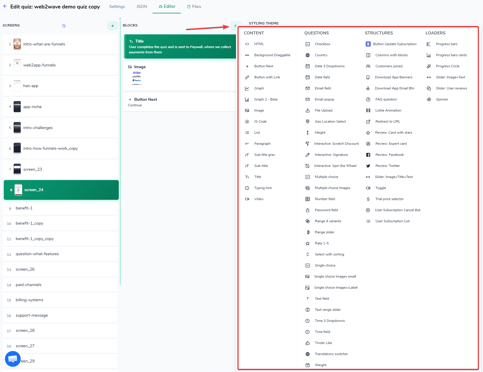
Using "plus" shaped button to select new Block in the Quiz Editor
Add new block
Screen Properties
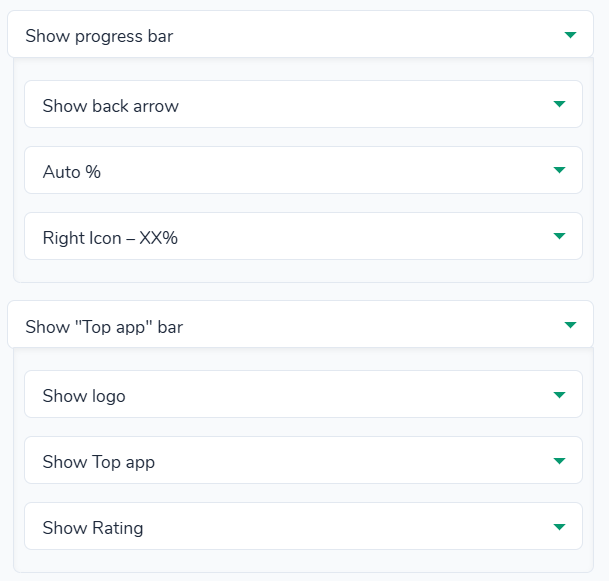
This is a screen settings panel for one step in a builder, where you set the screen ID, its behavior (skip or not, what the next screen is) and options for the progress bar and top bar.
At the bottom there’s a field for custom HTML in the top bar and an internal note, so this screen lets you fine‑tune how this funnel step looks and is tracked.
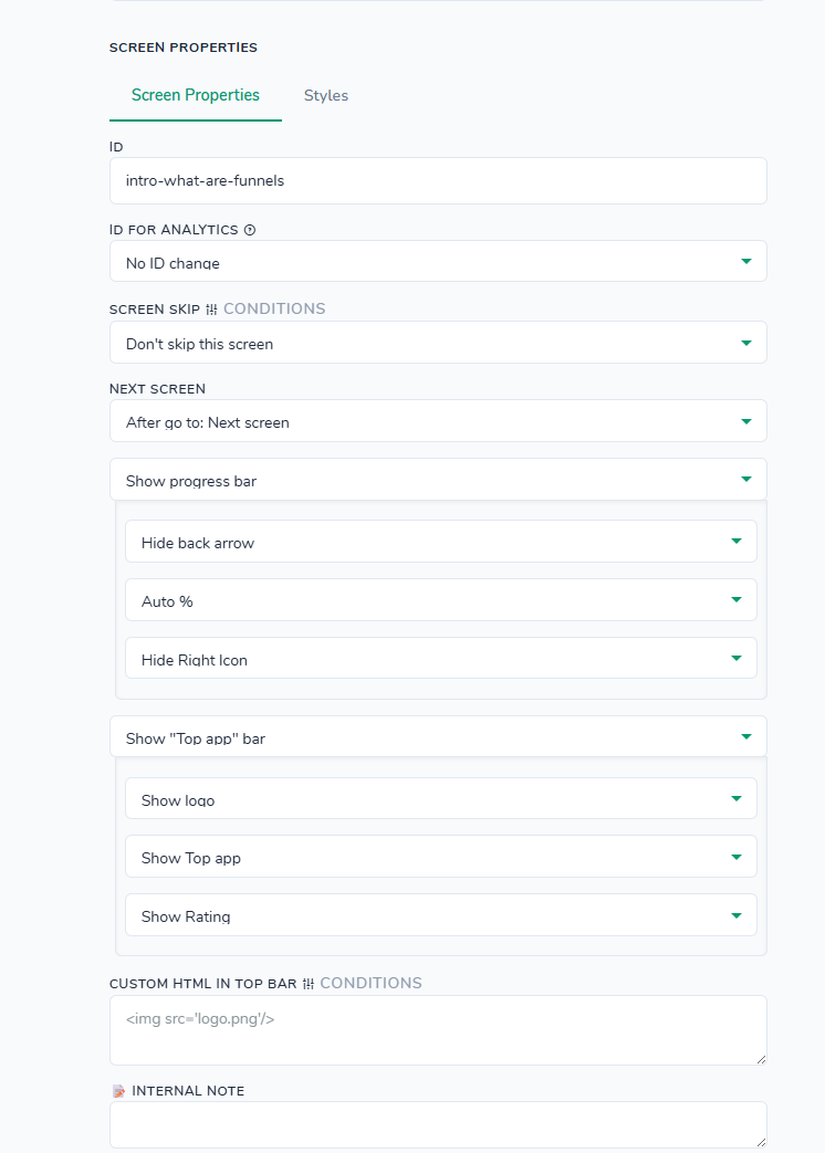
Screen properties can define screen conditional logic, ID for analytics and "Progress bar" with "Top app" bar.
ID: value can be used for navigation between screen.
ID For Analytics: This ID will be used in analytics. Use it to merge this screen with other screen in analytics.
Screen skip options:
- Don't skip this screen
- Skip this screen
- Skip this screen on JS condition
Next screen options:
- After go to: Next screen
- After go to: Select screen
- After go to: By JS Condition
// scenario: user goes through all the questions and gets to the specific screen. After this screen we want to display a screen that matches those answers.
function(answers) {
  var s = answers['web2wave'];      // First screen name
  var f = answers['best-4-funnels'];   // Second screen name

  // Conditional logic, client chooses from first and second screens
  if (
    s === 'I want to build best funnel' &&
    f === 'I want to save money and time'
  ) {
    return 'result'; //client would be navigated to screen named result
  }

  // If client chooses other options
  if (
    s === 'I prefer to do everything on my own' &&
    f === 'I want to have comprehensive analytics'
  ) {
    return 'passiveIncome'; //client would be navigated to screen named passiveIncome
  }
}
Show progress bar
Show "Top app" bar
Custom HTML in Top bar
//scenario: you want to display a bar with discount text. In that block write the following:
International Women’s Day SALE: <br>75% OFF - ENDS SOON
//<br> is used to send text to a new line.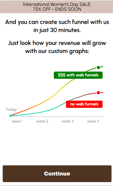
How to set custom text at the top of the page
Screen Properties > Styles
The Styles tab in Screen Properties lets you configure visual settings that are applied to the entire screen.
CSS inline styles this field to add raw CSS declarations that will be rendered as an inline style attribute on the screen container.
CSS class for screen to add one or more CSS class names that will be added to the screen container. You can then target these classes in your own stylesheets for advanced customization.
Background color choose a color from the picker or enter a specific value.
Background image defines a background image for the screen. Upload your image or use URL link.
Background size controls how the background image is scaled. Accepts any valid CSS background-size value (for example, auto, cover, contain, 100% 100%).
Background repeat controls how the background image is repeated across the screen. Accepts any valid CSS background-repeat value (for example, repeat, no-repeat, repeat-x, repeat-y).
Background position specifies the starting position of the background image on the screen. Accepts any valid CSS background-position value (for example, center center, top left, 50% 0).
Top app bar banner and quiz Progress bar
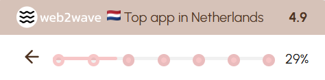
Q: How to increase/decrease circles amount?
A: This can be achieved via "Settings" tab, in the "Custom JSON config" field, by adjusting "Progress_Bar_Circles".
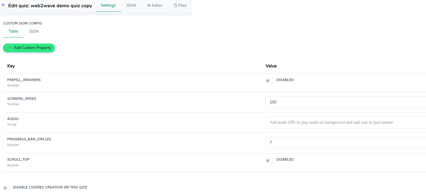
Settings tab > Custom Json Config
You can manage predefined quiz properties as key–value pairs. These properties are available to configure either in the table view or directly as raw JSON.
Prefill answers enable or disable automatic pre-filling of answers in the quiz. Turn it on if you want previously stored or default answers to appear automatically for the respondent. Use case scenario: To prevent user-entered data (such as email addresses or any other input) from disappearing when navigating between quiz screens (for example: when a user enters their email on the email screen, navigates to the plan selection, and returns to the email screen), enable the Prefill answers option in Quiz Settings, which automatically repopulates all previously entered responses."
Screens speed controls how fast screens change during automatic transitions. Set a higher or lower value (in milliseconds) to adjust the timing between screens.
Audio accepts a URL to an audio file. When set, this audio plays in the background and an audio icon is added to the quiz header.
Progress bar circles defines how many steps/circles the progress bar displays. Set this to match the number of logical steps you want to visualize in the header.
Scroll top controls whether the page should automatically scroll to the top when navigating between quiz screens. Enable it to force the viewport back to the top on each screen change.
Disable Cookies creation on this Quiz controls whether the quiz is allowed to store its own cookies in the visitor’s browser. Please note: if enabled, some convenience features may not work as expected (for example, session continuity or detailed per-user journey analytics), because the system cannot reliably recognize the same visitor across screens.
Add Custom Property button to define additional key–value pairs that are not in the predefined list.
Common parameters
Every element supports these advanced options.
Position on screen - controls where the block is rendered relative to other content (for example, on top of the page layout or on bottom).
Visibility - defines whether the block is shown or hidden, with optional conditions to toggle it based on user answers or other data.
If you set Hide option for "JS code" block, the code will not be executed.CSS inline styles - adds raw CSS declarations directly to the element’s style attribute for quick visual overrides without editing global stylesheets.
CSS class - assigns one or multiple custom class names so you can target the block from your own external or global CSS.
HTML attributes - allows adding arbitrary HTML attributes (data-* attributes, roles, test IDs, etc.) to integrate with tracking, automation, or accessibility tools.
Internal note - a non‑visible comment field for editors where you can document implementation details, logic, or to-dos; users never see this in the live widget.
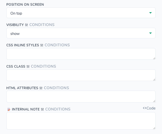
These options are available for ALL blocks
CONDITIONS button
Dedicated article about conditional logic with examples is here.
Most Common parameters have a CONDITIONS button next to the field. Clicking CONDITIONS opens the Conditional Logic for: corresponding option, where you can define one or more Override Rules. Each override rule has: a scope selector (All of these (AND) / Any of these (OR)), a list of conditions (e.g. user_property with operators like exists, ==, contains), and a VALUE text area that defines what this field will be set to when the rule matches.
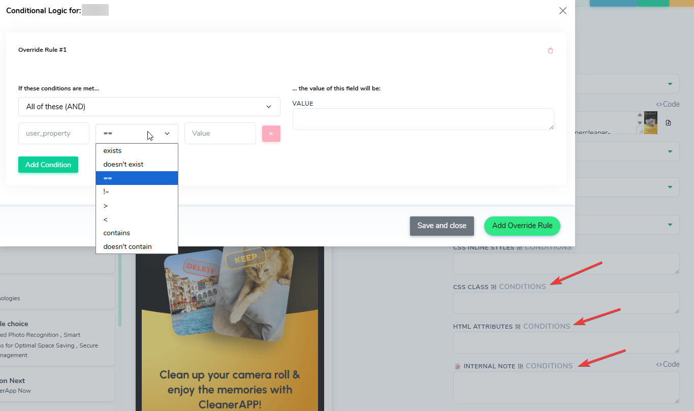
Conditions button to override default logic
You can click Add Override Rule multiple times to create Override Rule #1, Override Rule #2, and so on, each with its own conditions and value.
exists the property is present and has any value (not empty/null).
doesn't exist the property is missing or empty for this user/event.
== the property value must be exactly equal to the value you specify (string/number match).
!= the property value must be anything except the value you specify.
> the property value must be greater than the value you specify (used for numeric values like amount, step, score).
< the property value must be less than the value you specify.
contains – the property value must include the substring you specify (for example, a URL or text that contains a certain part).
doesn't contain the property value must not include the substring you specify.
Use case scenario: show different images for men and women on later screens, based on the answer on the first screen.
On the first screen named as welcome, you use a "Single choice block" with options “Male” and “Female”. In the VALUE field of each option you set a user property, for example:
option 1 -> VALUE: Men
option 2 -> VALUE: Women The name of this screen (welcome) becomes the user_property key where this answer is stored.
Values are case sensitive. If you can't find your value in the dropdown list, input it manually and "select" it from dropdown to apply.
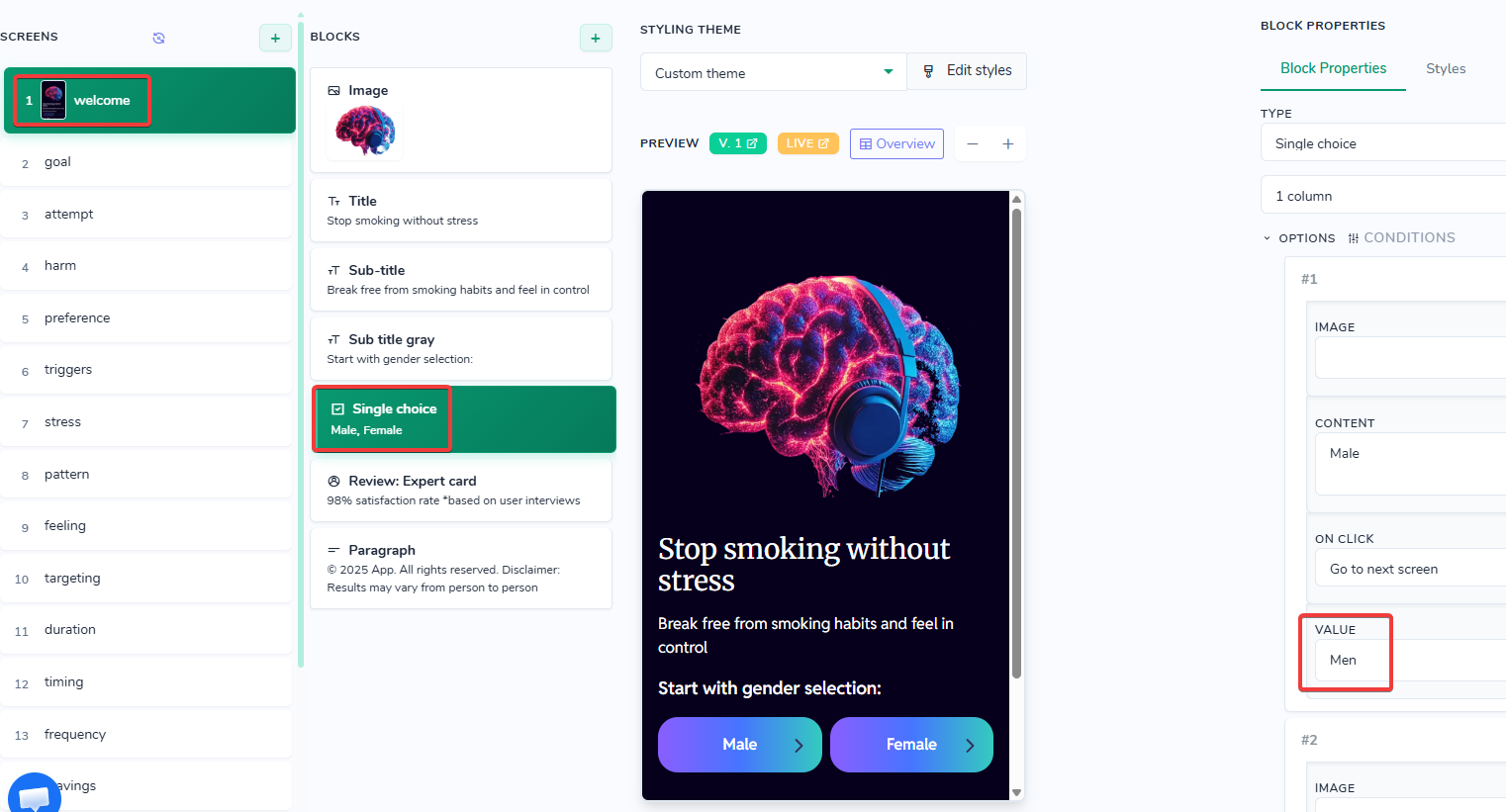
Choice screen when you can define values to be used in conditional logic for user's choice
On the following screens you open CONDITIONS for the SRC field of the image and create override rules. In each rule, instead of using gender as the property name, you select user_property -> welcome and compare it to the value from step 1:
Override Rule #1: welcome == Men -> VALUE: URL of the image for women
Override Rule #2: welcome == Women -> VALUE: URL of the image for men
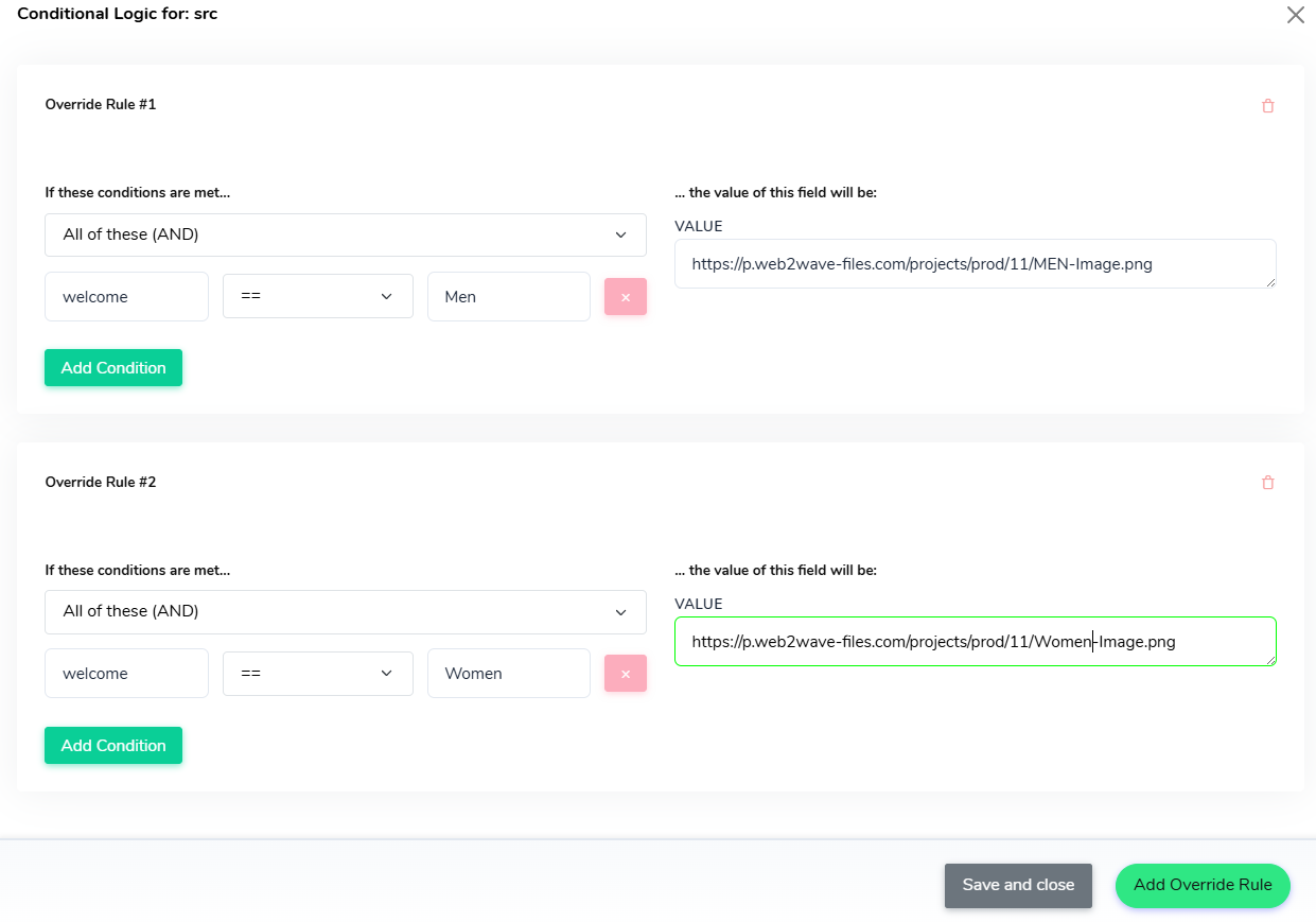
Use "Save and close" button and then to save changes for Conditional Logic.
At runtime, web2wave reads the user_property from the first screen and applies the matching override rule. As a result, users who chose “Male” option, see male‑specific images on the next screens, and users who chose “Female” see female‑specific images, without duplicating screens, and the same VALUEs (Men / Women) can be used to slice performance metrics in Analytics tab.
Content > HTML
"type": "html"
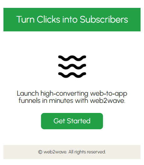
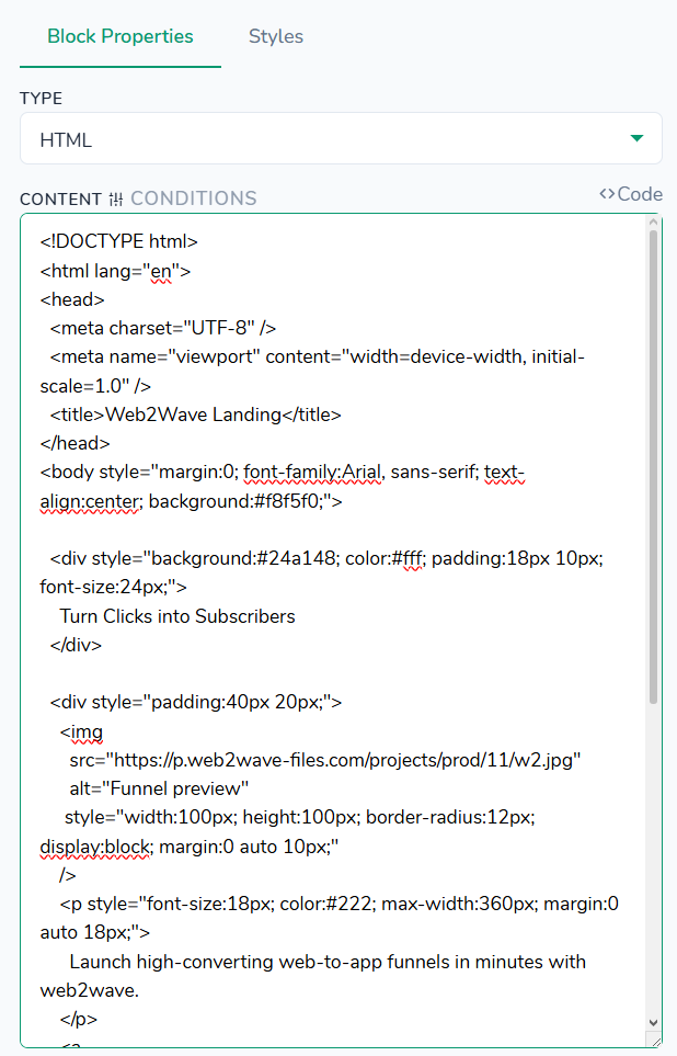
Styles tab - no styles defined for this block type.
Content > Audio Player
"type": "audio"
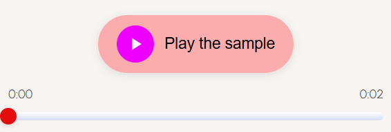
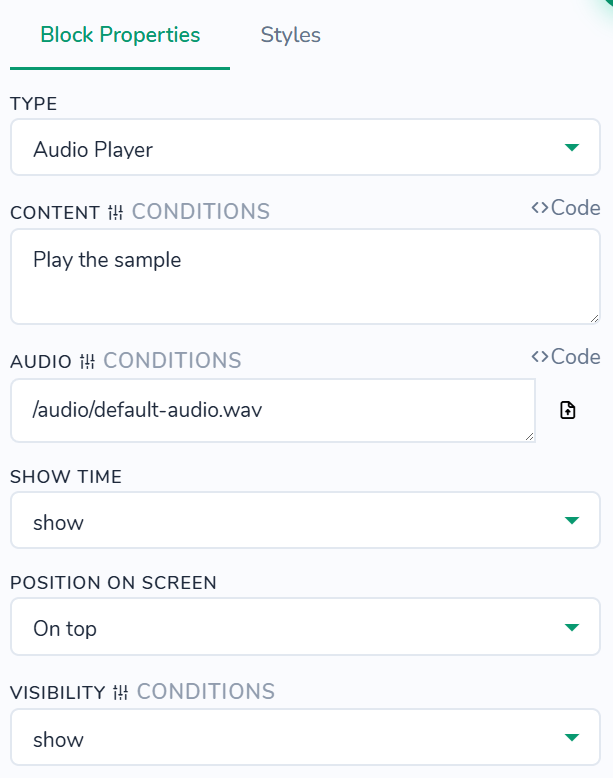
Styles tab - control the appearance of audio player elements in supported blocks. All settings here affect only this block instance and are applied on top of your global theme styles. You can customize button background and text colors, play/pause icon color and circle background, timeline track and played part backgrounds, scrubber color, and time color (when shown); adjust button font size, weight (Default, 100-900, normal, bold, bolder, lighter), line height, plus time font size, weight (Default, 100-900, normal, bold, bolder, lighter), and line height (when shown); set button width and height, icon circle width and height, timeline width and height, scrubber width and height; tweak button gap, padding (vertical and horizontal px), and margin bottom; round button and timeline corners using border radius (Top-L/Bot-R px, Top-R/Bot-L px); apply button box shadow; set button content alignment (Default, center, flex-start, flex-end, space-between, space-around, space-evenly); and configure container background, padding (vertical and horizontal px), margin (vertical and horizontal px), border, and border radius (Top-L/Bot-R px, Top-R/Bot-L px) around the entire block.
Content > Background Draggable
"type": "background-draggable"
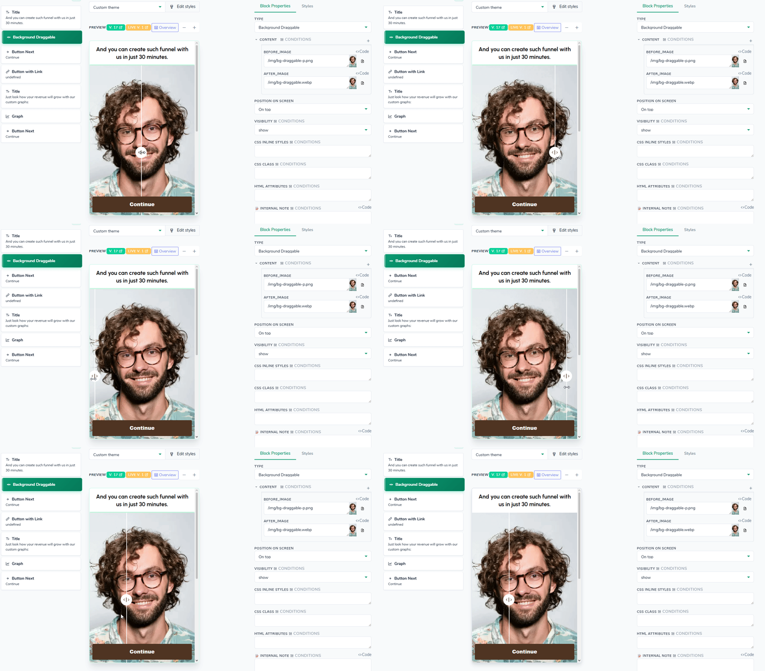
Easy drag effect to show image difference
Styles tab - No styles defined for this block type.
Content > Button Next
"type": "button"
Styles tab - control the visual appearance and layout of the navigation button. All settings here affect only this button instance and are applied on top of your global theme styles. Note: disabled colors are used when the button is not clickable. Container section affect the wrapper, not the button itself.
Content > Button with Link
"type": "button-link"
To redirect a user to a quiz or paywall, remove the domain and leading part of the URL and keep only the relative path. Example: your URL is https://quiz.theBest.com/paywall/downsell use /paywall/downsell in the CONTENT field instead.
Styles tab - uses the same style options as the Button Next block.
Content > Graph
"type": "graph"
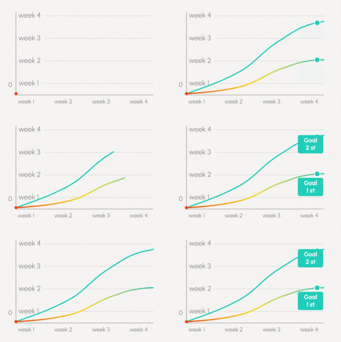
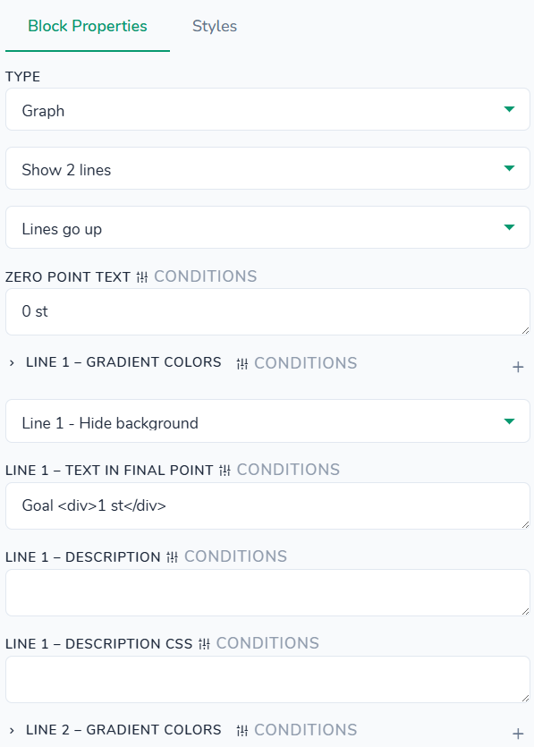
Styles tab - No styles defined for this block type.
Content > Graph 2 - Beta
"type": "graph-new"

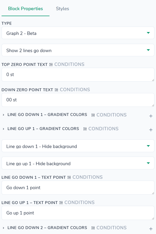
Styles tab - No styles defined for this block type.
Content > Image
"type": "image"

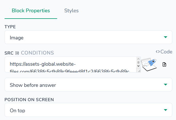
Styles tab - control the size, spacing, alignment, and container of the image. All settings here affect only this image instance and are applied on top of your global theme styles. You can adjust maximum width, explicit width and height, top/bottom margins, border radius, text (image) alignment, and optional container background, padding, margin, border, and border radius.
Content > JS Code
"type": "js-script"
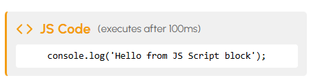
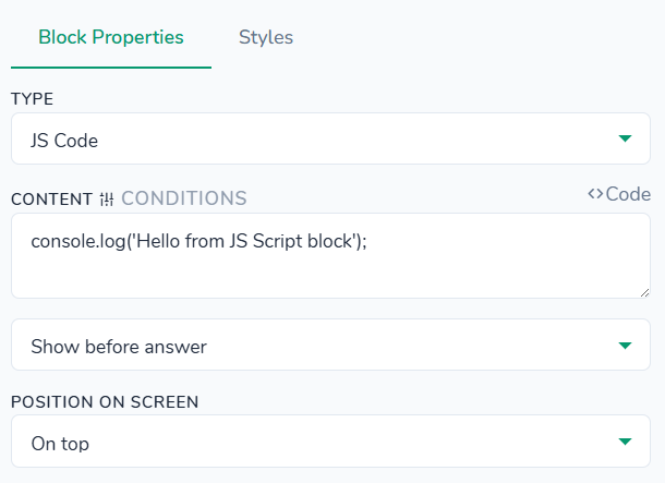
Styles tab - No styles defined for this block type.
Content > List
"type": "list"
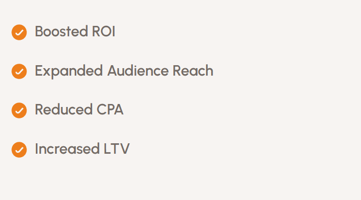
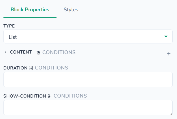
Styles tab - control the visual appearance, spacing, and container of list items. All settings here affect only this list instance and are applied on top of your global theme styles. You can change the list item text color, font size, and line height, adjust top/bottom margins and the spacing between items, set text alignment, and optionally configure a container background, padding, margin, border, and border radius around the whole list.
Content > Paragraph
"type": "paragraph"
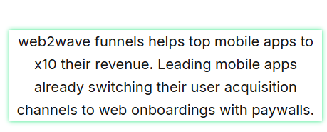
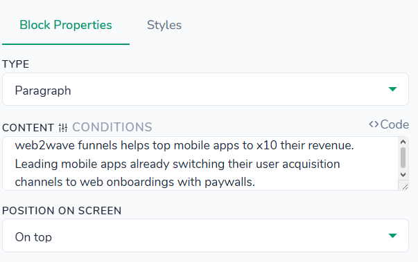
Styles tab - control the text styling, spacing, and container of the paragraph. All settings here affect only this paragraph instance and are applied on top of your global theme styles. You can change the text color, link color, and link hover color, adjust font size, font weight, line height, and a separate font weight for strong text, set vertical and horizontal margins, choose text alignment, and optionally configure a container background, padding, margin, border, and border radius.
Content > Sub title gray
"type": "sub-title-gray"

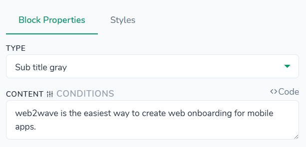
Styles tab - control the appearance of the gray subtitle text. All settings here affect only this subtitle instance and are applied on top of your global theme styles. You can adjust the text color, font weight, font size, and line height, set vertical and horizontal margins, choose text alignment, and optionally configure a container background, padding, margin, border, and border radius around the subtitle area.
Content > Sub-title
"type": "sub-title"
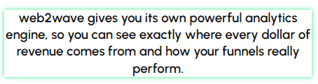
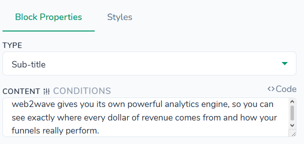
Styles tab - control the appearance of the sub‑title text. All settings here affect only this sub‑title instance and are applied on top of your global theme styles. You can configure text color, font weight, font size, and line height, adjust vertical and horizontal margins, choose text alignment, and optionally set a container background, padding, margin, border, and border radius around the sub‑title.
Content > Title
"type": "title"

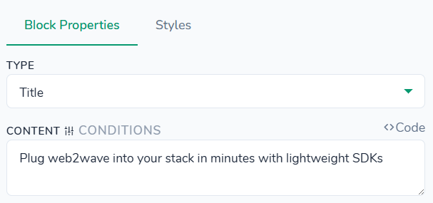
Styles tab - control the visual appearance and spacing of the main title. All settings here affect only this title instance and are applied on top of your global theme styles. You can change the text color and optional background, highlight specific words using a dedicated highlight color, adjust font weight, font size, and line height, configure margins and padding, set border radius for rounded corners, choose text alignment, and optionally define a container background, padding, margin, border, and border radius around the title.
Content > Typing hint
"type": "answer-hint"

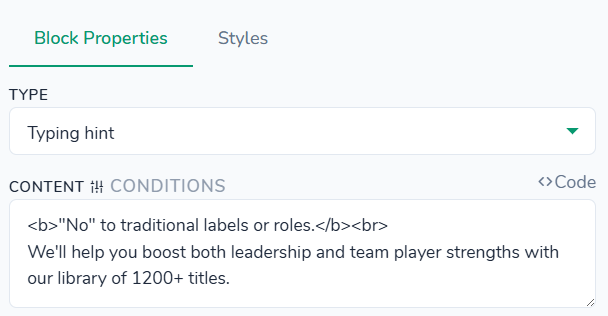
Styles tab - control the appearance and layout of the typing hint area (the helper text shown near input fields). All settings here affect only this typing hint instance and are applied on top of your global theme styles. You can customize background and text colors (including a separate color for the header text), adjust font size, font weight, header font weight, and line height, set inner padding and outer margins, configure border radius and border style, and optionally define a container background, padding, margin, border, and border radius around the whole hint block.
Content > Video
"type": "video"
Fullscreen adaptable values: "Normal size" and "Fullscreen adaptable (fills viewport)". If latter is enabled, it is possible to enable or disable "Click to play/pause" option.
On video end values: 'Do nothing" and "Move to next screen".
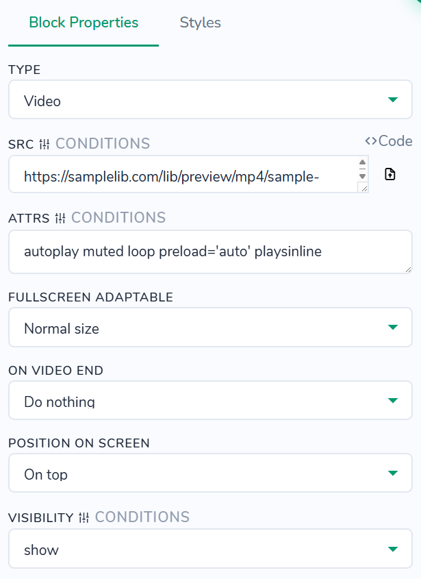
Styles tab - control the size, spacing, and container of the video player. All settings here affect only this video instance and are applied on top of your global theme styles. You can set the player width and maximum height, adjust vertical and horizontal margins, round the player corners with border radius, and optionally define a container background, padding, margin, border (example value: 2px dashed,solid, dotted, double), and border radius around the video.
Questions >
Questions > Checkbox
"type": "required-checkbox"
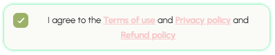
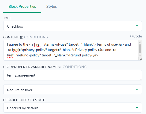
Styles tab - control the appearance of the checkbox input and its label. All settings here affect only this checkbox group instance and are applied on top of your global theme styles. You can customize background and border colors for the input (default and checked states), label text, links, and emphasis labels (strong and em), adjust label font size, line height, and font weights, set input size, gap between checkbox and label, margins and padding for the whole block, and define input border radius. Additionally, you can tweak form‑group top/bottom margins and optionally configure a container background, padding, margin, border, and border radius around the entire checkbox group.
Q: Where to adjust Terms of use, Privacy policy and Refund policy data?
A: "Projects" -> "General" tab, "Legal data for Terms of Use and Privacy Policy" section.

Legal data is adjusted in the Project settings
It is also recommended to input the Support address in the Emails tab, so it would substituted automatically.

This address is used to be inserted automatically in the documents. It can be different from the one used in the "Send emails from (Email from)"
At last, the text of these documents can be adjusted in the "Quizzes & Pages tab", by using the pencil button.

How to customize the default text of Terms of use, Privacy Policy and Refund policy
Questions > Country
"type": "country"
Country block lets the user pick their country from a searchable dropdown. When the visitor clicks or taps the field, a dropdown with all available countries is displayed; they can scroll through the list or start typing to quickly filter and select a country.

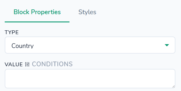
Styles tab - control the appearance of the country field, its dropdown list items, and the surrounding container. All settings here affect only this block instance and are applied on top of your global theme styles. You can customize colors for the field text, background, focus border, placeholder, list background, list item text and hover states, adjust font sizes and font weight for the field and list items, configure field width and list max height, set padding for the field and list items, tweak borders and border radius for both the field and the list, enable or remove the last item border, and define focus and list box shadows. Additionally, you can align list item text and optionally configure a container background, padding, margin, border, and border radius around the whole country block (container options work the same way as in the Title → Styles section).
Questions > Date 3 Dropdowns
"type": "date-format"

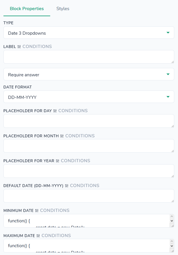
Styles - No styles defined for this block type.
Questions > Date field
"type": "date"
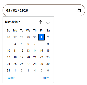
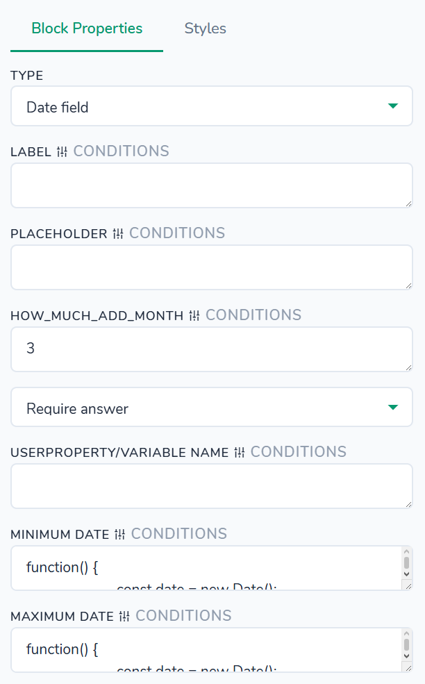
Styles tab - control the appearance of the date input, its label, error message, and container. All settings here affect only this date field instance and are applied on top of your global theme styles. You can configure colors for the label, input background and border, focus border, placeholder, and error message; adjust font weight and font size for the label and input text, as well as error message font size; set background image for the input icon if needed; tweak label margin, input padding, input text padding, and error message padding; control error message top margin; define input border and border radius; choose the input background position; and optionally configure a container background, padding, margin, border, and border radius around the whole field.
Questions > Email field
"type": "email"

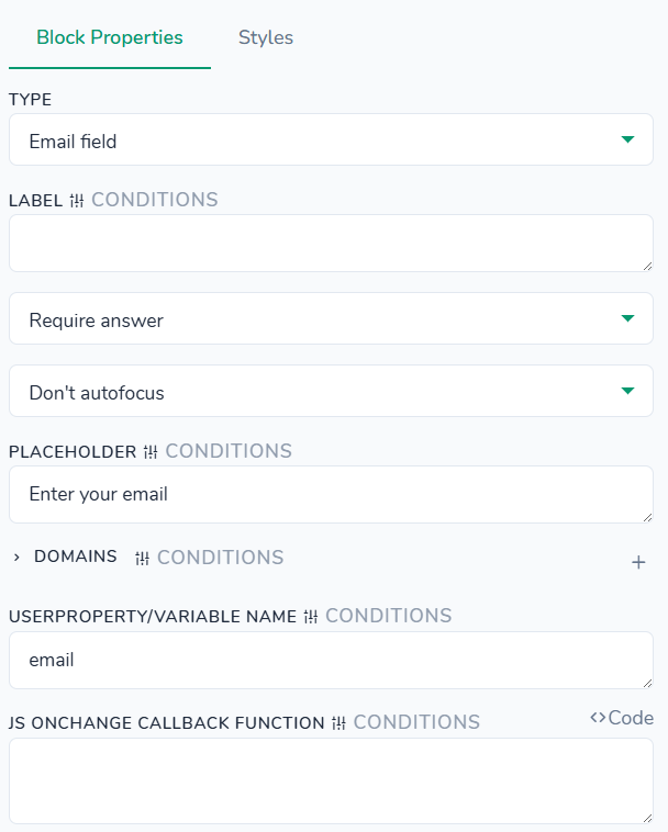
Styles tab - control the appearance of the email input, its label, error message, and container. All settings here affect only this email field instance and are applied on top of your global theme styles. You can configure colors for the label, input background and text, focus border, placeholder, and error message; adjust label font weight and size, as well as input font size and optional letter spacing; set background image for the input icon if needed; tweak label margin, input padding, input text padding, and error message padding, plus the top margin for the error message; define input border and border radius; choose the input background position; and optionally configure a container background, padding, margin, border, and border radius around the whole field
Questions > Email popup
"type": "popup-email"
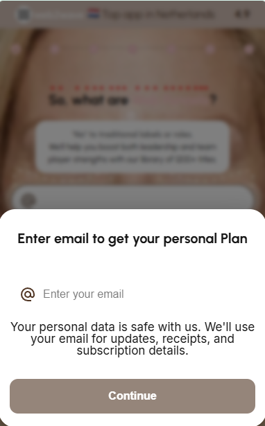
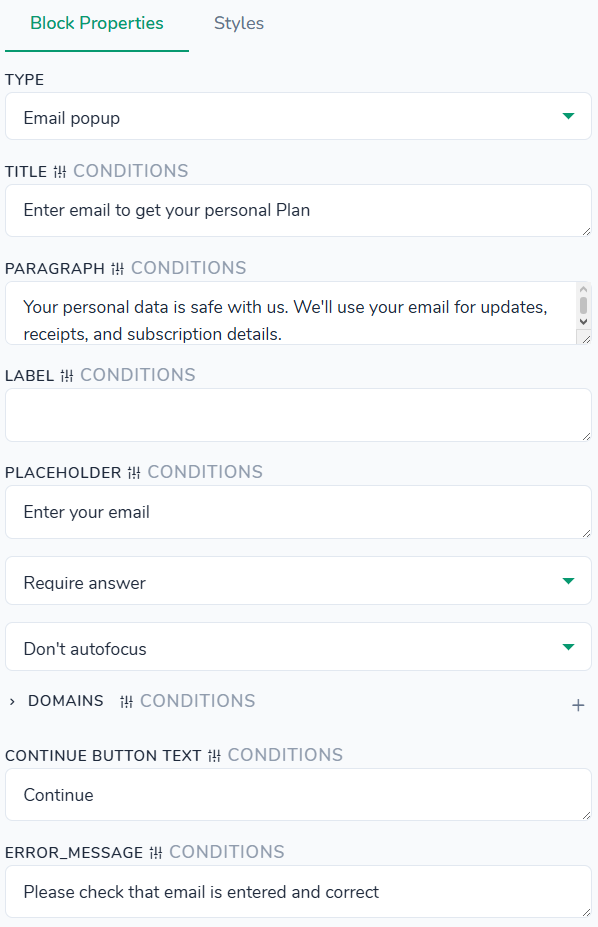
Styles tab - control the appearance of the email popup container, its title, subtitle, label, input, suggestions list, and surrounding box. All settings here affect only this popup instance and are applied on top of your global theme styles. You can customize background and text colors for the popup, title, subtitle, label, input, placeholder, invalid state, suggestions background, and suggestion text; adjust font sizes and font weights for title, subtitle, label, input, and suggestions; configure container min/max height and suggestions max height; tweak margins and padding for the header, title, input, and suggestions; set borders and border radius for the input and suggestions list (including an optional bottom border for the last suggestion); and define box shadows for the popup container and suggestions dropdown. Additionally, you can optionally configure a container background, padding, margin, border, and border radius around the entire popup.
Questions > File Upload
"type": "file-upload"
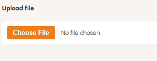
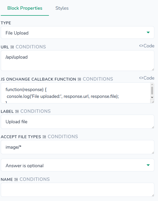
Styles tab - control the appearance of the upload field, its label, upload button, and container. All settings here affect only this file upload instance and are applied on top of your global theme styles. You can adjust gap between label and field, label font weight, font size, color, margin bottom, and line height, plus the color used for the “required” asterisk. For the input you can configure background, border, border radius, padding, text color, hover background and border color, focus border color and focus box shadow, disabled background, and input font size. For the button you can configure font weight and size, background, text color, padding, margin right, hover background, and border radius. Additionally, you can optionally configure a container background, padding, margin, border, and border radius around the entire file upload block.
Questions > Geo Location Select
"type": "city"
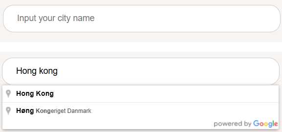
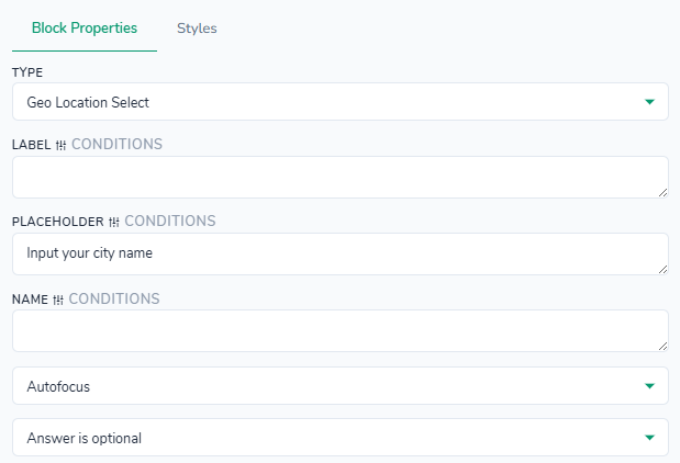
Styles tab - control the appearance of the geo input (city/region), its label, error message, and container. All settings here affect only this geo field instance and are applied on top of your global theme styles. You can configure colors for the label, input background and text, focus border, placeholder, and error message; adjust label font weight and size, input font weight and size, optional input letter spacing, and error message font size; add a background image (for example, a location icon) to the input; tweak label margin bottom, input padding, input text padding, and error message padding, plus the top margin for the error message; define input border and border radius; choose the input background position; and optionally configure a container background, padding, margin, border, and border radius around the entire geo block.
Questions > Height
"type": "height"
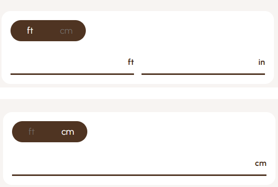
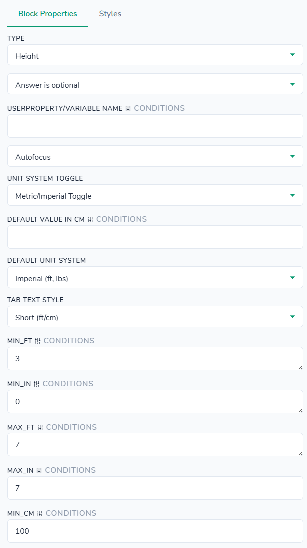
Styles tab - control the appearance of the height selector tabs, numeric input, and container. All settings here affect only this height block instance and are applied on top of your global theme styles. You can customize colors for the background, tabs background, tab item text, tab hover and active states, input background and text, focus border, and unit (cm/ft) text. Typography options let you set font size for tab labels, main value, and unit label, plus input font weight. You can also configure tabs max width, content min width, input height, general padding, tabs bottom margin, tabs padding, and individual tab‑item padding; adjust margins for the content and options label; and define borders and border radius for the block, tabs, and active tab items, including a bottom border for the input. Additionally, you can control box shadow for the container and optionally configure container padding, margin, border, and border radius around the entire height block.
Questions > Interactive: Scratch Discount
"type": "scratch-discount"
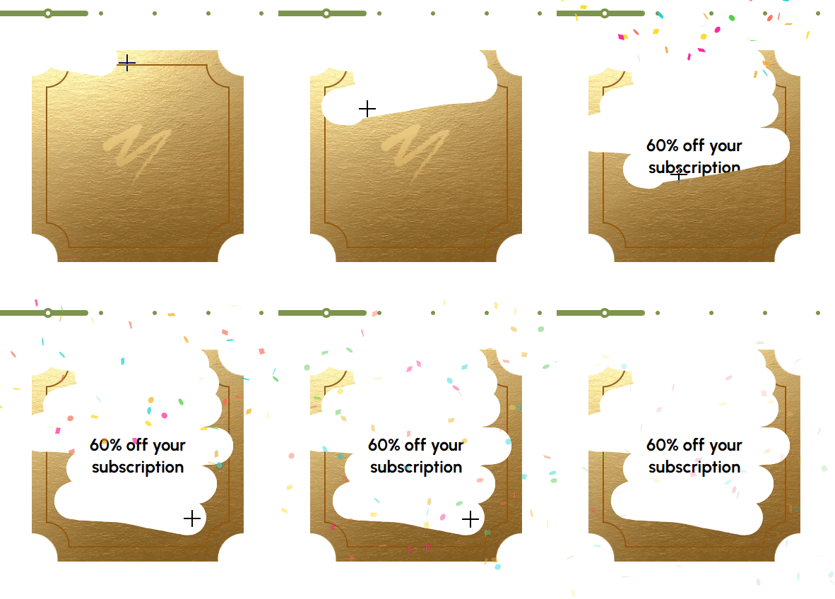
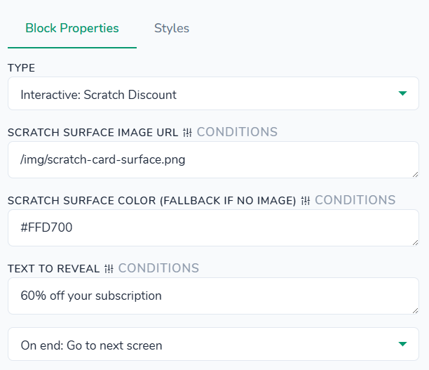
Styles tab - control the appearance of the scratch card text and the area that hides it. All settings here affect only this scratch block instance and are applied on top of your global theme styles. You can set the reveal background color (the color that appears after scratching) and the text color, adjust the text font size and weight, define maximum width and fixed height for the scratch area, configure inner content padding, and round the corners using border radius. Additionally, you can optionally configure a container background, padding, margin, border, and border radius around the entire scratch block.
Questions > Interactive: Signature
"type": "signature"
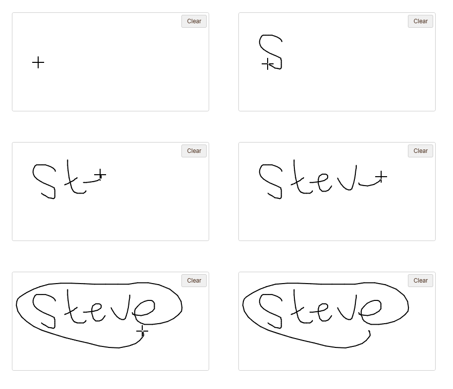
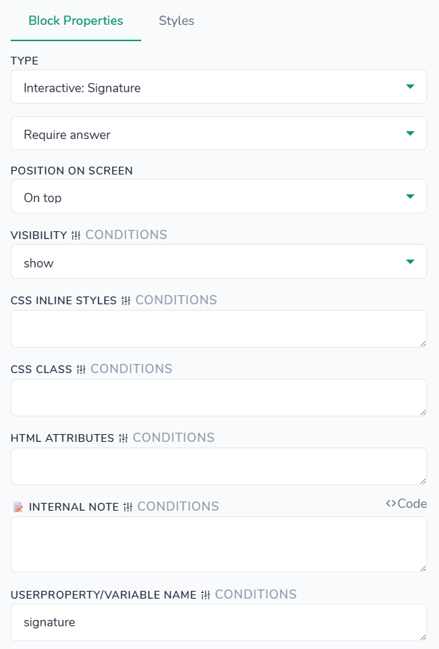
Styles tab - control the appearance of the signature canvas, clear button, and container. All settings here affect only this signature block instance and are applied on top of your global theme styles. You can customize colors for the canvas background, pen stroke, and clear button (background and text), adjust the clear button font size, set canvas width and height as well as pen width, and configure clear button padding. You can also define borders and border radius for both the canvas and the clear button, and optionally configure a container background, padding, margin, border, and border radius around the entire signature block.
Questions > Interactive: Spin the Wheel
"type": "spin-wheel"
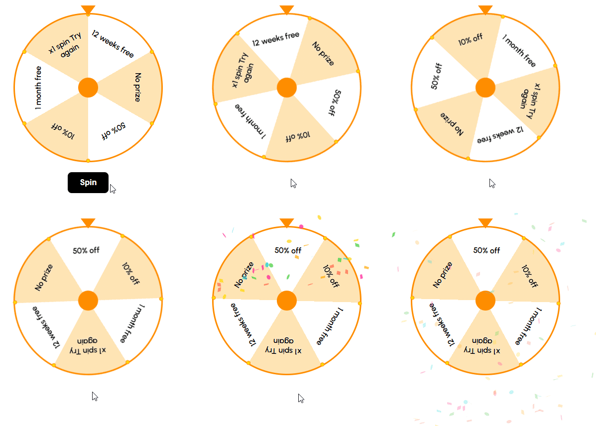
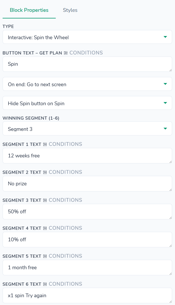
Styles tab - control the appearance of the spin wheel, its segments, pointer, spin button, and container. All settings here affect only this spin block instance and are applied on top of your global theme styles. You can configure colors for the wheel border, individual segment backgrounds, segment text, pointer, button background, and button text; adjust font sizes and font weights for the segment labels and button text; define wheel size and border width; and tweak button padding and top margin. You can also round the button corners via button border radius and optionally configure container background, padding, margin, border, and border radius around the entire block.
Questions > Multiple choice
"type": "options-multiple"
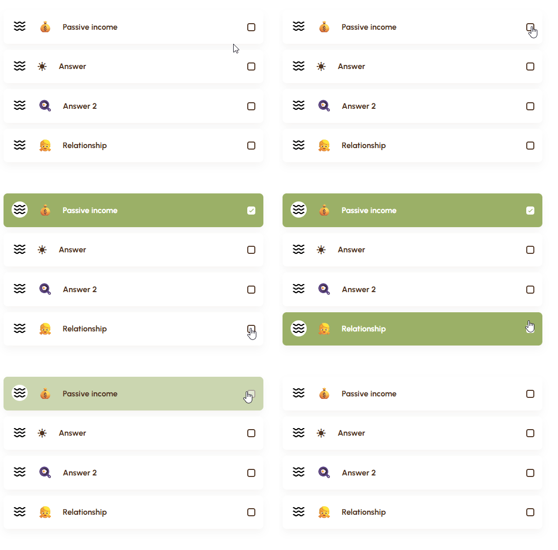
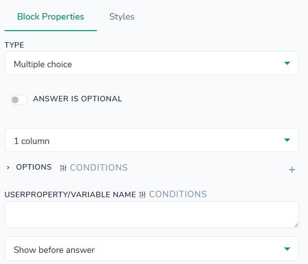
Styles tab - control the appearance of individual choice items (single and multiple), optional icons/images, and the surrounding container. All settings here affect only this choice block instance and are applied on top of your global theme styles. You can configure colors for selected item background and text, regular item background and text, right‑side icon, multiple‑choice square background, border, and checkmark (including separate styles for the selected state). Typography options let you adjust item font weight, line height, and emoji font size. You can also set item min height, right icon size, image max width, multiple‑choice checkbox and checkmark sizes, vertical spacing between choices, item padding, and gaps between content and emoji. Border & radius settings control item border radius and multiple‑choice checkbox border/border radius, plus an optional item box shadow and precise positioning offsets for the right icon and checkmark. Additionally, you can configure container background, padding, margin, border, and border radius around the entire choice block.
Questions > Multiple choice images
"type": "options-multiple-images"
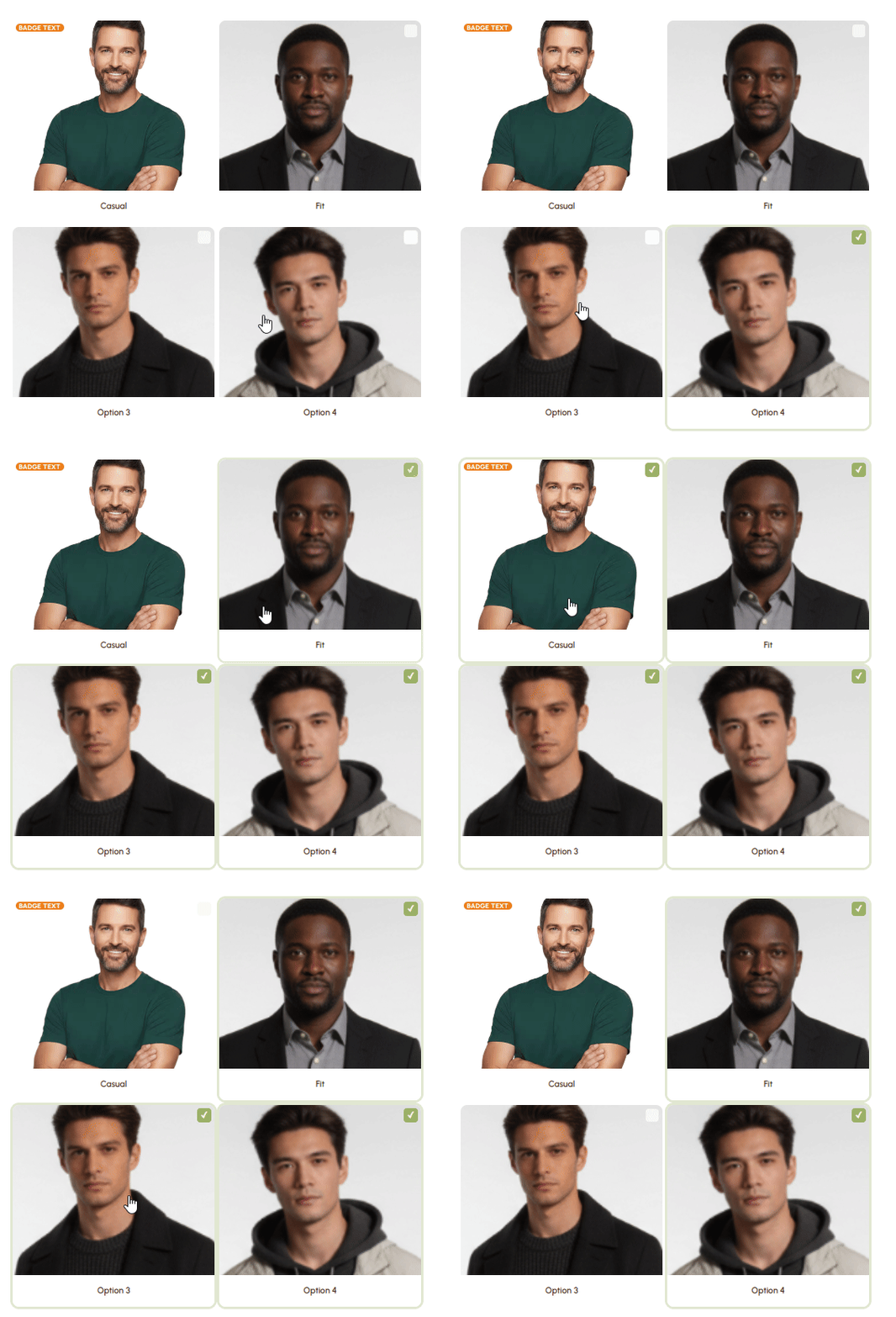
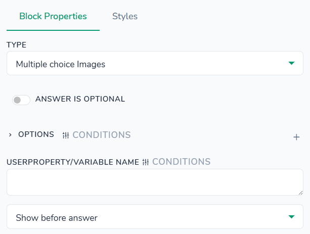
Styles tab - control the appearance of choice items in both tile and checkbox layouts. All settings here affect only this choice block instance and are applied on top of your global theme styles. You can set background, border, and checkmark colors for the checkbox, including separate styles when the item is selected; customize title text color, label background, and overall item background; adjust checkbox size (width and height), label minimum height, gaps between checkbox and label, outer margins, and label padding; and configure item borders, border radius, and a subtle box shadow for the selected state. Additionally, you can position the checkbox precisely using top/right offsets and optionally configure container border and border radius around the whole block.
Questions > Number field
"type": "number-field"
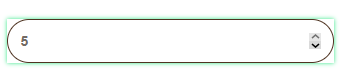
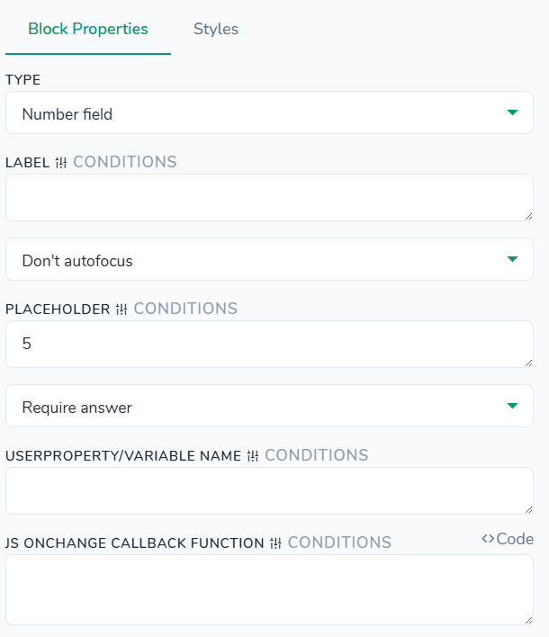
Styles tab - control the appearance of the generic text input, its label, error message, and container. All settings here affect only this block instance and are applied on top of your global theme styles. You can configure colors for the label, input background and text, focus border, placeholder, and error message; adjust label font weight and size, add an optional background image to the label area, and set input font weight, size, and letter spacing; tweak label margin bottom, input padding, input text padding, and error message padding, plus the top margin for the error message; define input border and border radius; choose the input background position; and optionally configure a container background, padding, margin, border, and border radius around the whole block.
Questions > Password field
"type": "password-field"
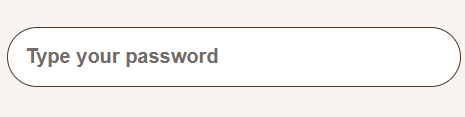
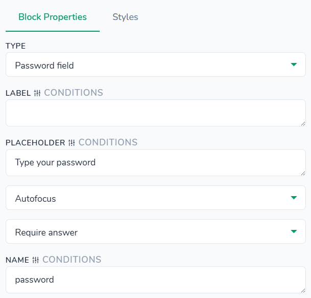
Styles tab - control the appearance of the password input, its label, error message, and container. All settings here affect only this password field instance and are applied on top of your global theme styles. You can configure colors for the label, input background and text, focus border, placeholder, and error message; adjust label font weight and size, optionally add a background image (for the lock/eye icon), and set input font weight, size, and letter spacing; tweak label margin bottom, input padding, input text padding, and error message padding, plus the top margin for the error message; define input border and border radius; choose the input background position (for positioning the visibility icon); and optionally configure a container background, padding, margin, border, and border radius around the whole block.
Questions > Range 4 variants
"type": "range-4-variants"
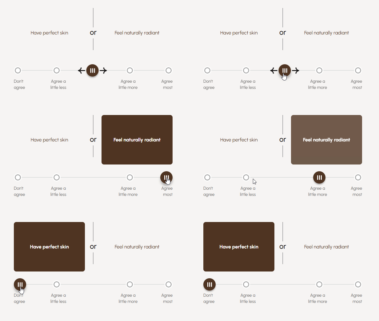
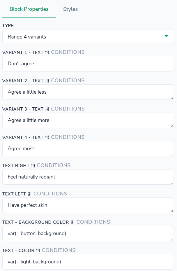
Styles tab - no styles defined for this block type.
Questions > Range slider
"type": "range-field"
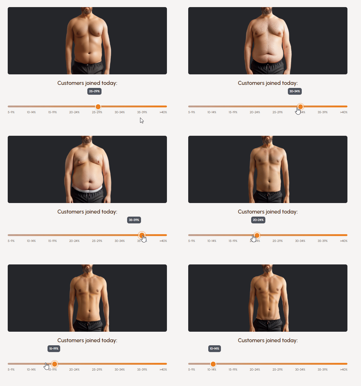
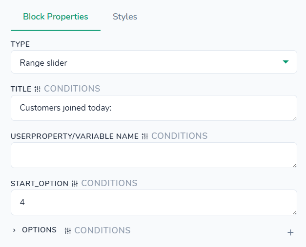
Styles tab - control the appearance of the slider image, track, pointer (handle), tooltip, and container. All settings here affect only this slider instance and are applied on top of your global theme styles. You can configure colors for the image background, title text, tooltip background and text; adjust font sizes and weights for the title, tooltip, and label; set dimensions such as image height, track height, pointer size, and overall margins; and tweak spacing like image and title bottom margins, tooltip padding, and tooltip‑to‑track offset. Border & radius settings let you round the image, tooltip, track, and pointer, and define pointer border and box shadow for a raised effect. Additionally, you can control title and tooltip text alignment, pointer vertical position, and optionally configure a container background, padding, margin, border, and border radius around the entire slider block.
Questions > Rate 1-5
"type": "options-evaluation"
After an option is clicked, the behavior can be configured in three ways:
- do nothing after selection,
- Undisable Next button,
- or automatically redirect the user to next or specified follow‑up screen.
Use case scenario:
The Undisable button option for rating scales only when the user is expected to make a one-time, irreversible rating on this screen. Once the user selects a value from 1 to 5, that option remains selected and cannot be changed or cleared on the same screen; the user can only proceed by clicking Continue/Next. This configuration is suitable for flows where the initial rating is intentionally locked in (for example, to capture a first-impression score). To avoid being stuck, the screen with this option enabled should require the user to press Continue/Next button to proceed to the next screen.
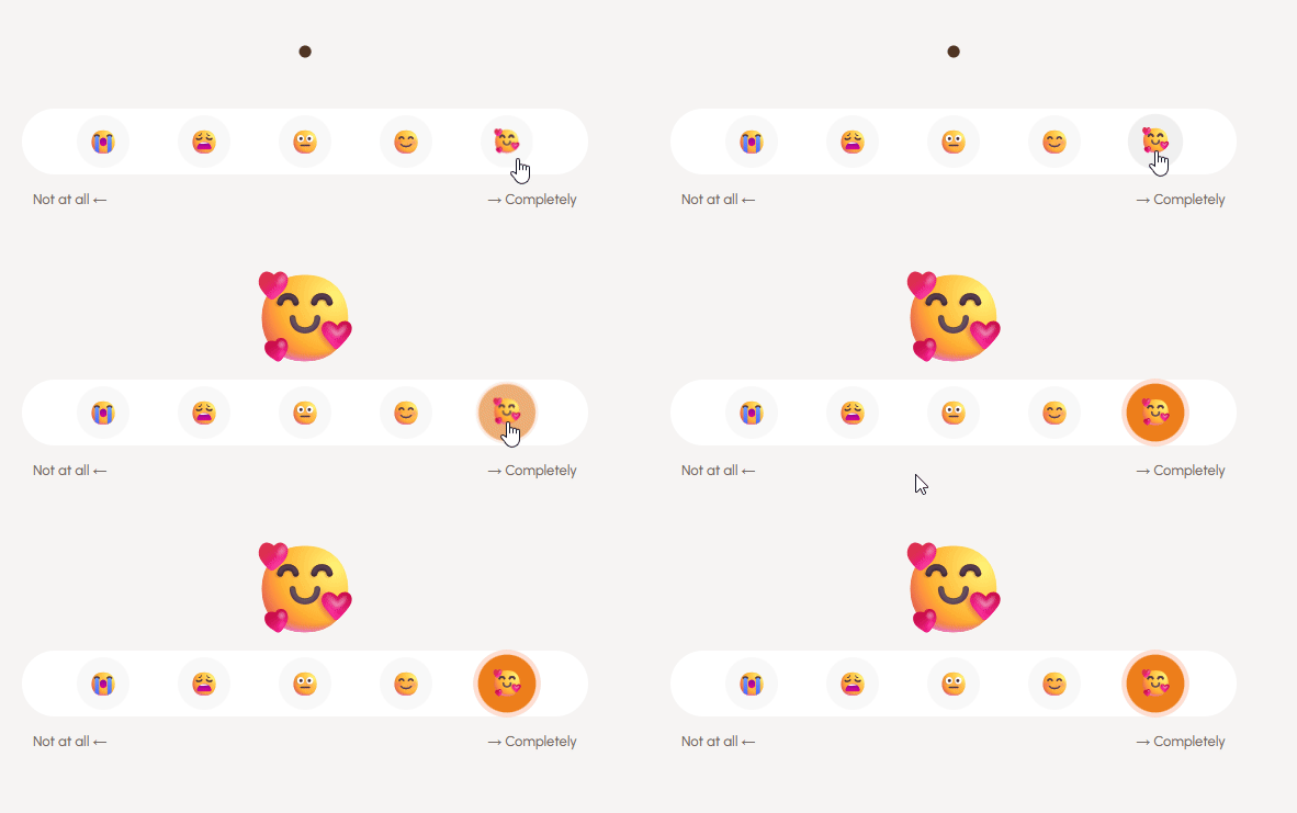
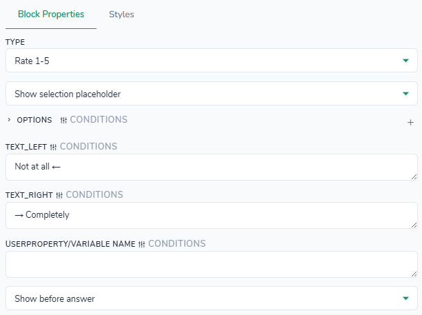
Styles tab - control the appearance of the numeric rating value, the list of age/weight labels, and the surrounding container. All settings here affect only this rate block instance and are applied on top of your global theme styles. You can customize colors for the main value, list background, selected background and text, count number badge, its hover state, and bottom helper text; adjust font weights, sizes, and line heights for the value, count numbers, and bottom text; and set dimensions such as count number width/height. Spacing options let you control bottom margins, column gaps, list padding, and bottom text padding. Border & radius settings define list and age/weight row rounding plus the count number border and a subtle box shadow when a value is selected. Additionally, you can configure container background, padding, margin, border, and border radius around the entire block.
Questions > Select with sorting
"type": "sort-select"
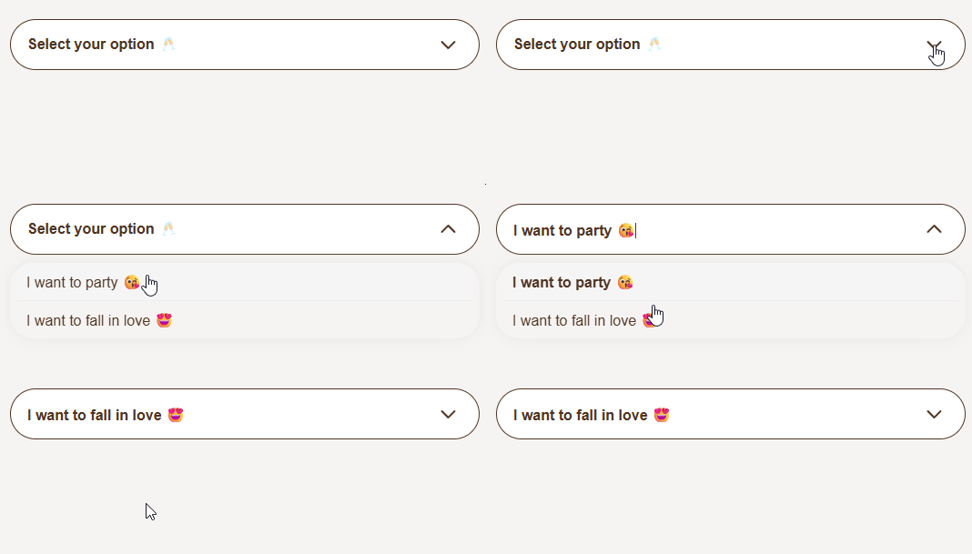
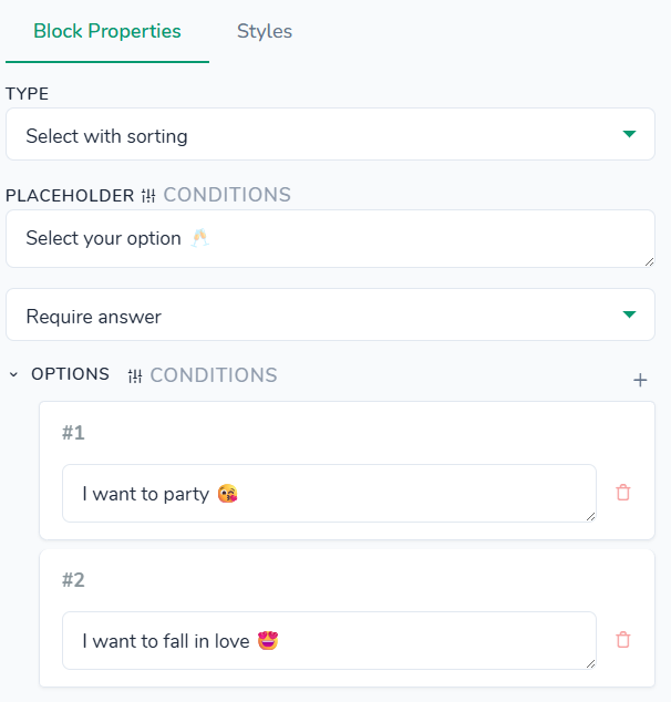
Styles tab - no styles defined for this block type.
Questions > Single choice
"type": "options"
Icon type: option allows selecting from "square icon", "circle icon", "arrow", or "none" and is displayed on the right side. Video with illustration is here.
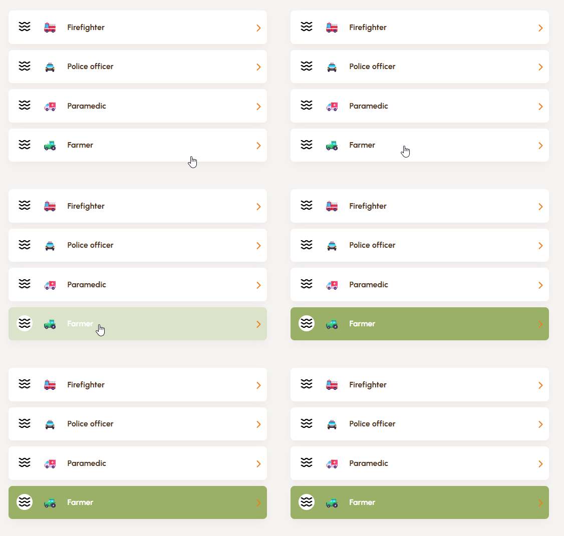
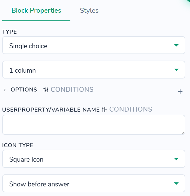
Styles tab - control the appearance of choice items with emojis, right‑side icons, and multiple‑selection checkboxes. All settings here affect only this choice block instance and are applied on top of your global theme styles. You can customize colors for selected items and text, regular item background and text, right‑icon stroke, multiple‑choice square background, border, and checkmark (with separate colors for the selected state). Typography options let you define item font weight, line height, and emoji font size. You can also set item min height, right icon size, image max width, and checkbox dimensions, adjust vertical spacing between rows, padding inside each item, and the horizontal gap between text and emoji; configure item border radius, multiple‑checkbox border/border radius, and item box shadow; fine‑tune positions of the right icon and multiple‑selection checkmark; and optionally set container background, padding, margin, border, and border radius around the entire block.
Questions > Single choice Audio
"type": "options-audio"
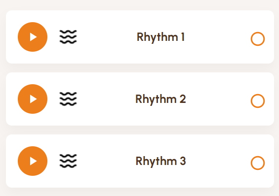
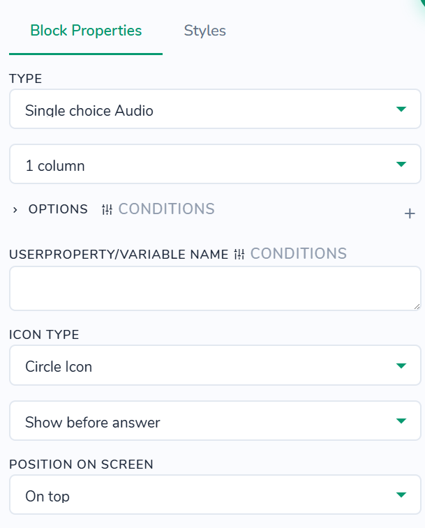
Styles tab - control the appearance of list items in supported blocks. All settings here affect only this block instance and are applied on top of your global theme styles. You can customize background and text colors, plus separate background and text colors when selected, along with progress bar background, selected progress bar background, right icon color, and selected right icon color; adjust item font weight (Default, 100-900, normal, bold, bolder, lighter), item line height, and emoji font size; set item min height, right icon width and height, and image max width; tweak line not last child margin bottom, padding (vertical and horizontal px), item gap, and emoji margin right; round corners using border radius (Top-L/Bot-R px, Top-R/Bot-L px); apply box shadow; position right icon from top and right; and configure container background, padding (vertical and horizontal px), margin (vertical and horizontal px), border, and border radius (Top-L/Bot-R px, Top-R/Bot-L px) around the entire block.
Questions > Single choice images small
"type": "options-images"
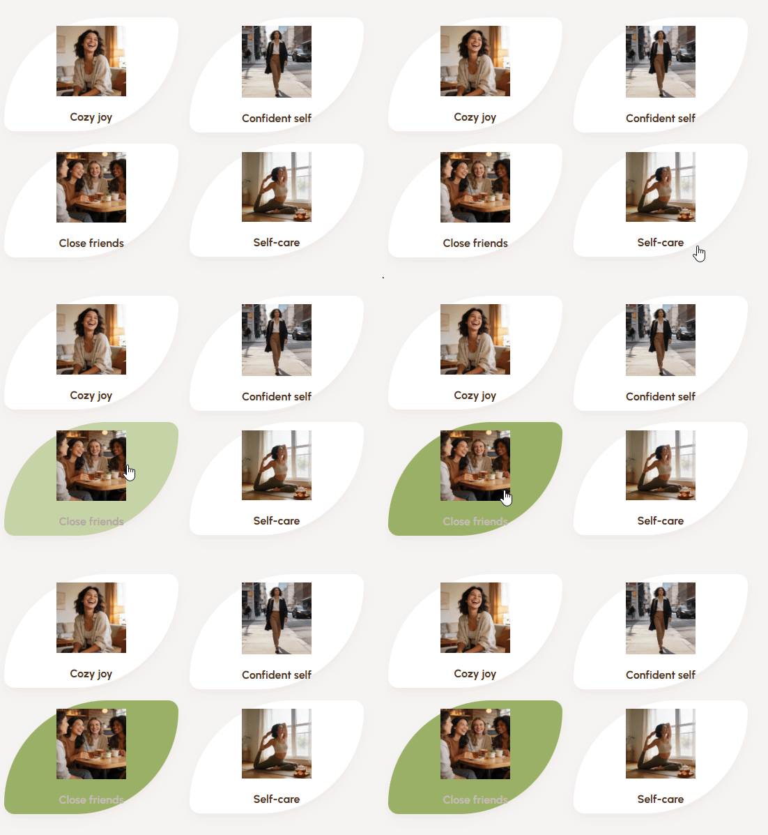
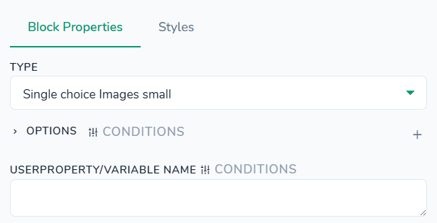
Styles tab - control the appearance of image cards used as choices. All settings here affect only this choice block instance and are applied on top of your global theme styles. You can customize card background and text colors, plus separate background and text colors when the card is selected; adjust text font weight, font size, and letter spacing; set card minimum height and maximum image width; tweak the gap between cards, inner card padding, and image bottom margin; round card corners using border radius; and apply a card box shadow for a raised effect. Additionally, you can configure container background, padding, margin, border, and border radius around the entire group of cards.
Questions > Single choice images + Label
"type": "options-images-horizontal"
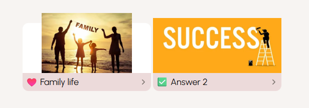
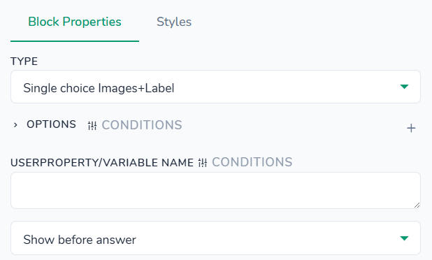
Styles tab - control the layout and appearance of the image with its text label and navigation arrow. All settings here affect only this image label instance and are applied on top of your global theme styles. You can customize colors for the text label background and text, as well as the arrow/right icon color; adjust label font size; set label width, container height, label minimum height, and image height; tweak row and column gaps, top padding, bottom margin for the label, and inner label padding; and round the label using border radius. Additionally, you can configure container border, container background, padding, and margin around the whole block.
Questions > Text field
"type": "text"
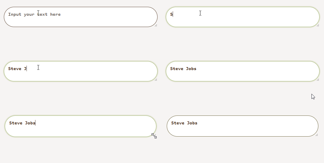
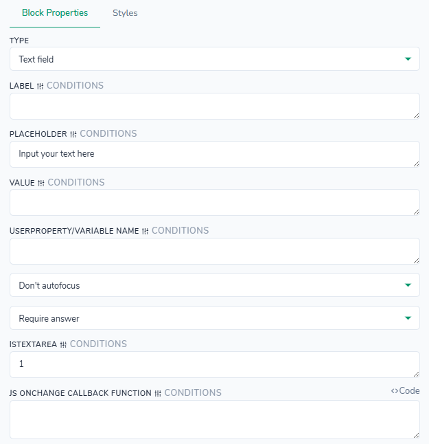
Styles tab - control the appearance of the text input, its label, error message, and container. All settings here affect only this text block instance and are applied on top of your global theme styles. You can configure colors for the label, input background and text, focus border, placeholder, and error message; adjust label font weight and size, optionally add a background image to the label area, and set input font weight, size, and letter spacing; tweak label margin bottom, input padding, input text padding, and error message padding, plus the top margin for the error message; define input border and border radius; choose the input background position; and optionally configure a container background, padding, margin, border, and border radius around the whole block.
Questions > Text Range Slider
"type": "text-range-slider"
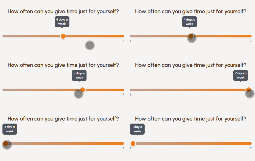
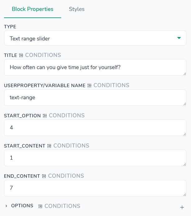
Styles tab - no styles defined for this block type.
Questions > Time 3 Dropdowns
"type": "time-select"
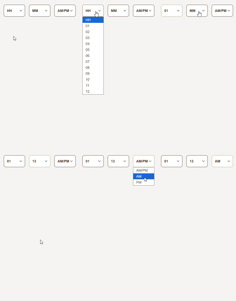
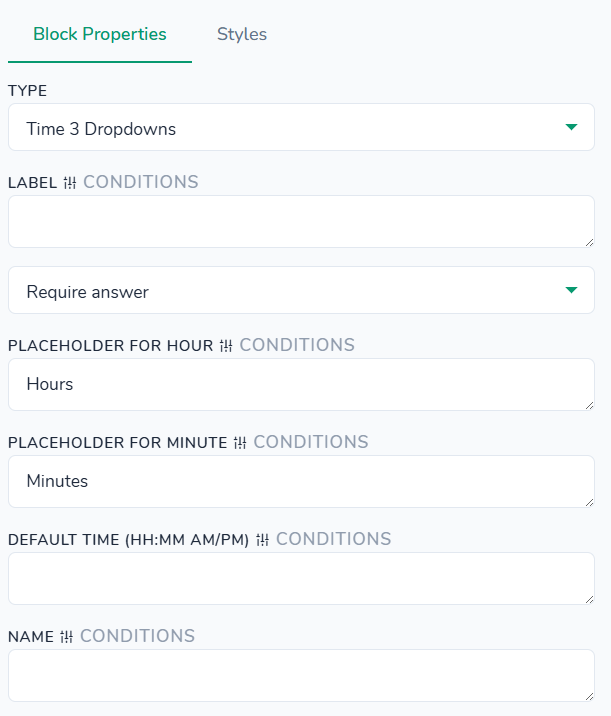
Styles tab - no styles defined for this block type.
Questions > Time field
"type": "time"
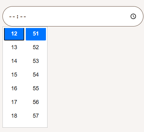
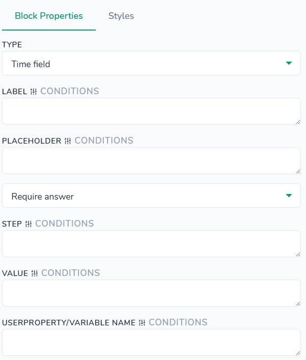
Styles tab - control the appearance of the time input, its label, error message, and container. All settings here affect only this time field instance and are applied on top of your global theme styles. You can configure colors for the label, input background and text, focus border, placeholder, and error message; adjust label font weight and size, optionally add a background image, and set input font weight, size, and letter spacing; tweak label margin bottom, input padding, input text padding, and error message padding, plus the top margin for the error message; define input border and border radius; choose the input background position (for aligning the clock icon); and optionally configure a container background, padding, margin, border, and border radius around the whole block.
Questions > Tinder Like
"type": "liking"
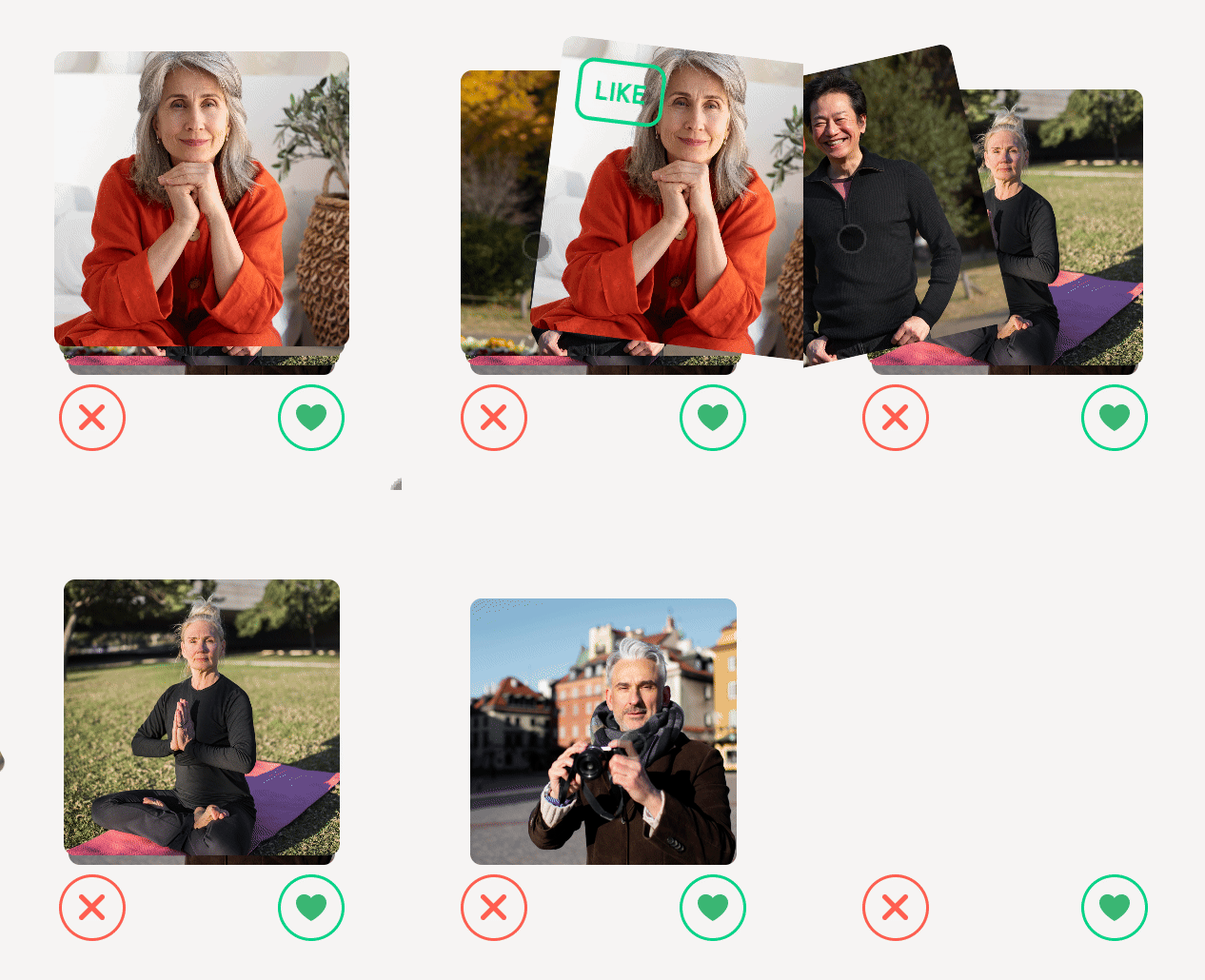
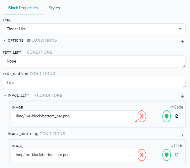
Styles tab - control the appearance and layout of the swipeable Tinder-style card. All settings here affect only this block instance and are applied on top of your global theme styles. You can customize the colors used for the “Nope” and “Like” indicators, set the overall card width and height, and define the size of the like/nope icons. Spacing options let you adjust the top margin for the icons inside the card. Additionally, you can configure container padding, margin, background, border, and border radius around the whole Tinder card area.
Questions > Translations switcher
"type": "translations"
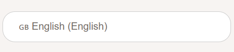
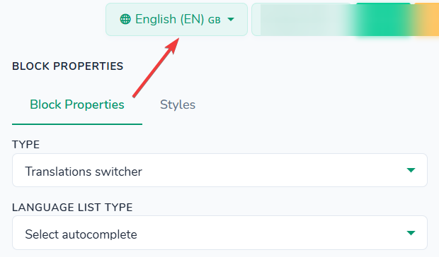
Available languages can be defined above the "Block Properties" section.
Styles tab - control the appearance of the switcher field, its dropdown list of options, and the container. All settings here affect only this switcher instance and are applied on top of your global theme styles. You can configure colors for the field text, background, focus border, placeholder, list background, list item text, and list item hover states; adjust font sizes and weights for the field and list items; tweak field padding and per‑item padding; define borders and border radius for both the main field and the dropdown list; set list item bottom borders and an optional “no border on last item”; and add focus and list box shadows. You can also align list item text, choose the list open/close transition, and optionally configure container background, padding, margin, border, and border radius around the whole switcher block.
Questions > Weight
"type": "weight"
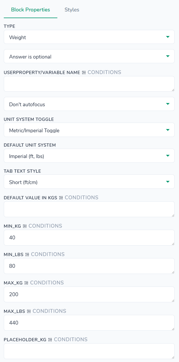
It is possible to configure minimum weight values to help users input value in this field (Min_KG and Min_LBS).
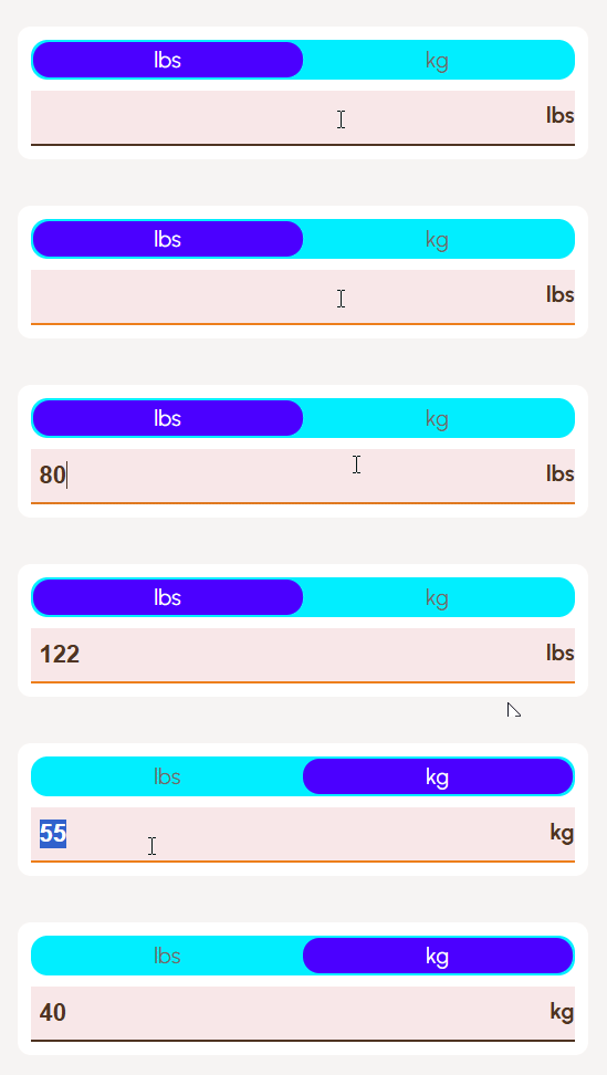
Styles tab - control the appearance of the weight selector tabs, numeric input, and container. All settings here affect only this weight block instance and are applied on top of your global theme styles. You can customize background and text colors for tabs, active tab, hover state, and input field; adjust font weights and sizes for the input value and unit label; set dimensions such as max tabs width, minimum content width, and input height; tweak general padding, tabs bottom margin, tabs padding, individual tab‑item padding, and active content margin; and define borders and border radius for the control, tabs, and active tab. Additionally, you can style the bottom border of the input, and optionally configure container background, padding, margin, border, and border radius around the entire weight block.
Structures >
Structures > Button Update Subscription
"type": "update-subscription-button"
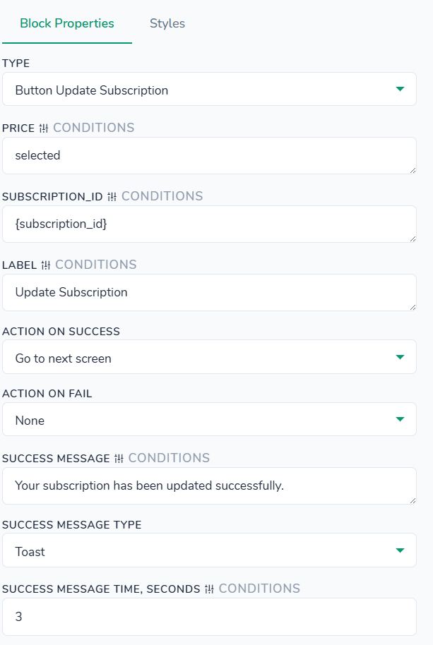
Allows you to change the product/price in active Stripe subscrption – which allows you to do downgrades/downsells/upgrades of users' subscriptions. Manual.
Use case scenario: you can implement 1 year subscription, for example. To do that, define required price ID in the Price, and in Subscription_id use {subscription.id} placeholder. Upon clicking, the latest user's subscription will update based on the price settings.
Styles tab - control the visual appearance and layout of a standalone button. All settings here affect only this button instance and are applied on top of your global theme styles. You can customize the button background and text colors, along with separate background, border, and text colors for the disabled state; adjust font size, weight, and line height for the label; set explicit width and height when needed; tweak outer margin and inner padding; configure border and border radius; choose the button position (static, fixed, etc.) and text alignment; and optionally configure a container background, padding, margin, border, and border radius around the button.
Structures > Container
"type": "container"
A Container block lets you group multiple elements together and apply a shared background, border, and other styling that can differ from the background and styling of the screen itself. This block is useful when you need an extra colored section, card-like wrapper, or layout box around a group of blocks.
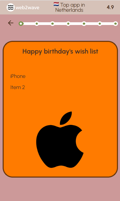
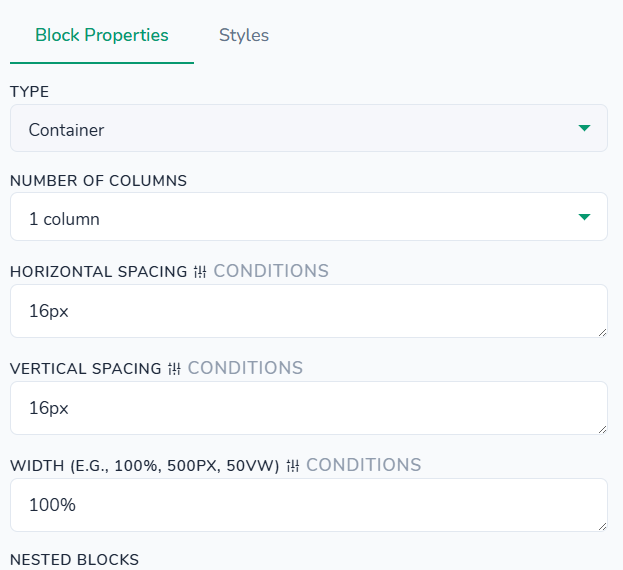
Styles tab - control a standalone layout container that can wrap other blocks. All settings here affect only this container instance and are applied on top of your global theme styles. You can set container width and height, customize background color, inner padding, and outer margin, and define border style (including custom CSS border values) plus individual corner radius values for rounded shapes.
Structures > Сolumns with blocks
"type": "columns"
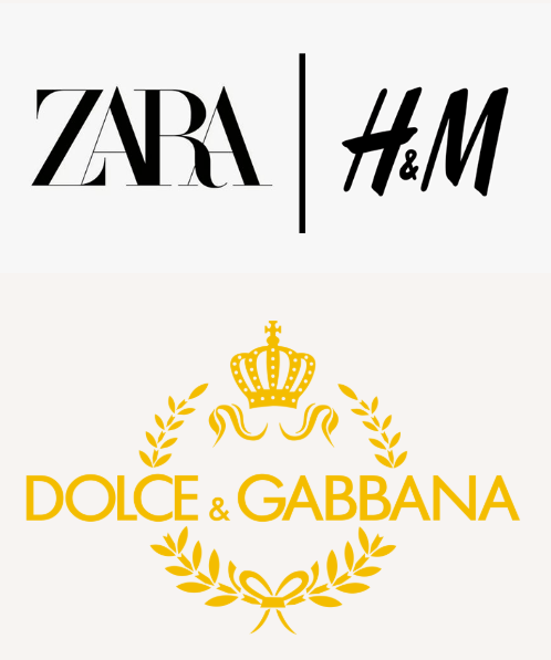
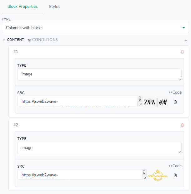
Styles tab - no styles defined for this block type.
Structures > Customers joined
"type": "customers-joined"
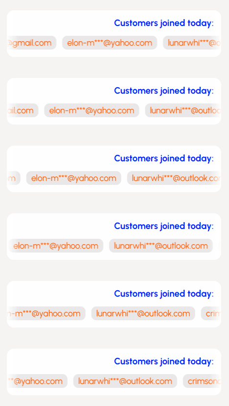
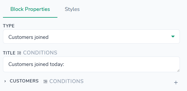
Styles tab - control the appearance of the customer highlight card (title, badge, and content) and its container. All settings here affect only this customers block instance and are applied on top of your global theme styles. You can customize background color, title and badge text colors, badge background and hover background, and hover text color; adjust font sizes and weights for the title and badge; set a maximum width for the card, outer margin, inner padding, bottom margin under the title, vertical content gap, and badge padding; configure card border and border radius plus an optional box shadow; align the title text; and optionally configure container background, padding, margin, border, and border radius around the whole customers section.
Structures > Download App Banners
"type": "download-app-banners"
In this block’s properties you can either specify app_store_link, google_play_link, and web_link explicitly, or leave them empty so that the values are automatically taken from the corresponding fields in the Projects → Deeplinks & Billing tab, manual on the matter.
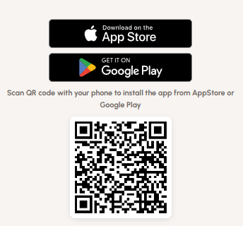
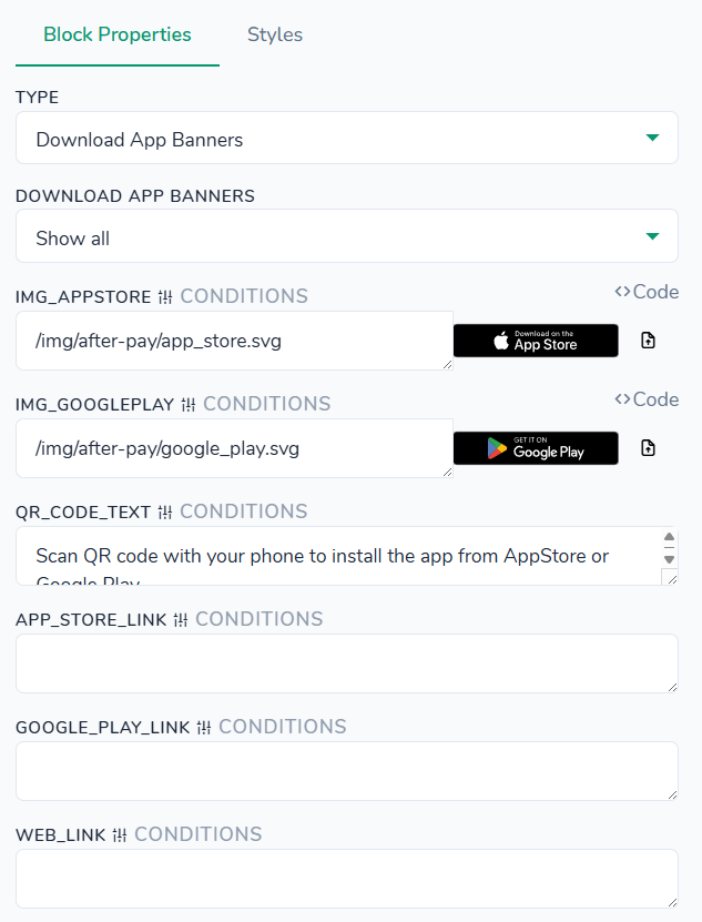
Styles tab - control the appearance of the QR code area, its text description, and the container. All settings here affect only this QR block instance and are applied on top of your global theme styles. You can set a maximum height for linked store badges, adjust QR code margin from the top, border radius, image width/height, and box shadow (including a separate hover shadow), and configure font weight, size, line height, and color for the QR description text. Additionally, you can customize the container background, padding, margin, border, and border radius around the entire QR section.
Structures > Download App Email Btn
"type": "send-download-link"
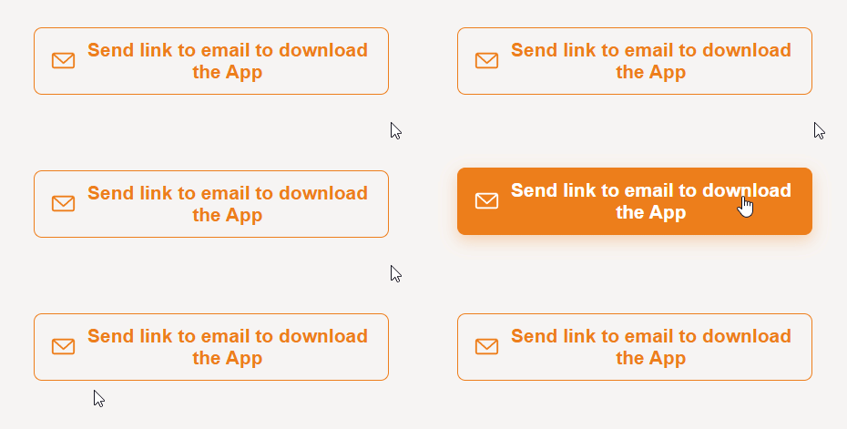
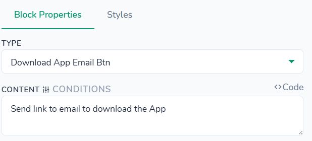
Styles tab - control the appearance of the final "Send" button that submits the quiz or form. All settings here affect only this send button instance and are applied on top of your global theme styles. You can customize background and text colors, plus separate background, border, and text colors for the disabled state; adjust font size, weight, and line height for the label; set optional width and height, inner padding, and corner radius; configure border style; choose button position and text alignment; and optionally configure container background, padding, margin, border, and border radius around the send button.
Structures > FAQ question
"type": "faq-question"
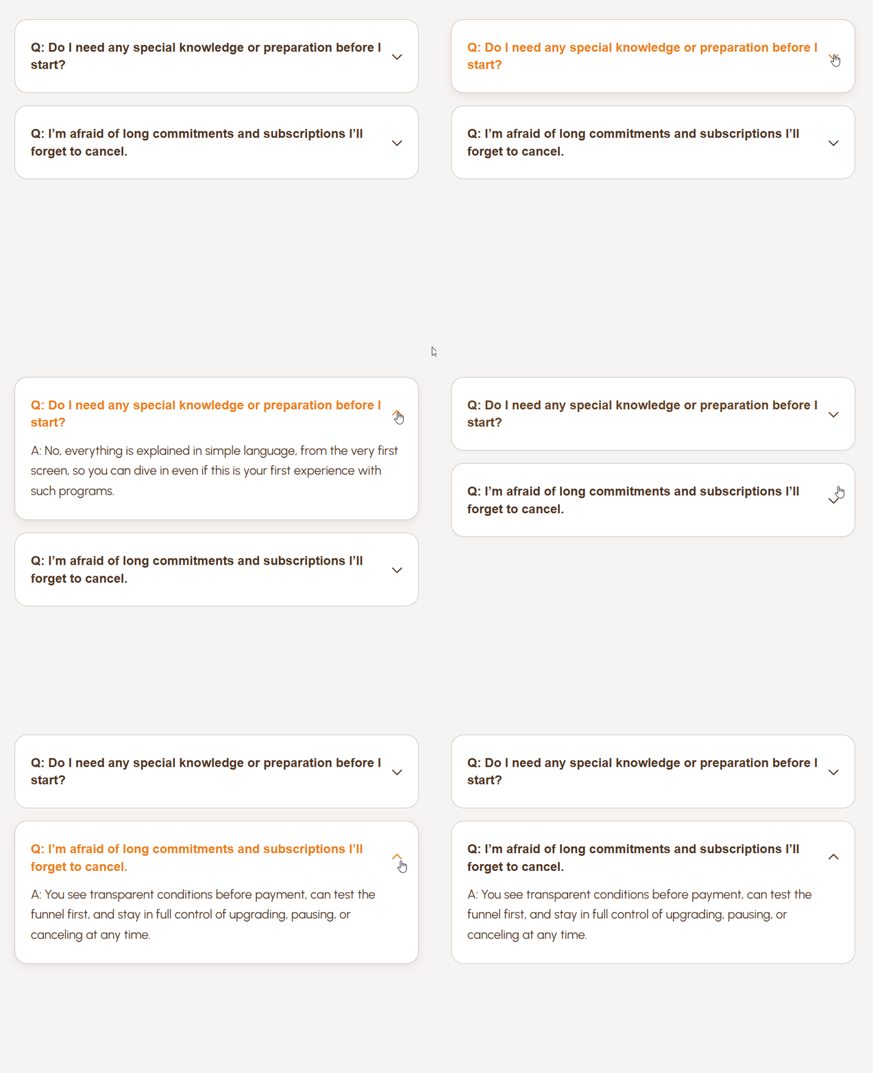
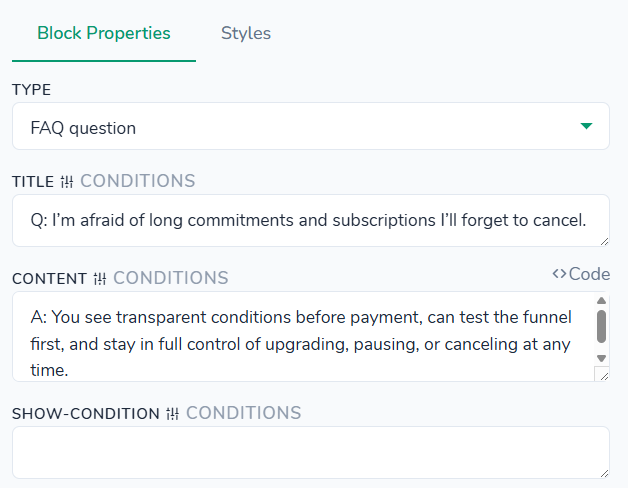
Styles tab - no styles defined for this block type.
Structures > Lottie Animation
"type": "lottie"
Manual about Lottie Animation block.
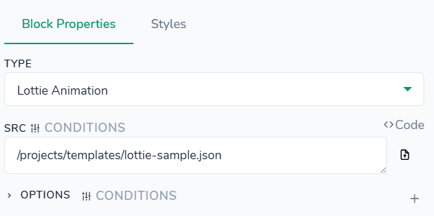
Styles tab - no styles defined for this block type.
Structures > Profile Summary
"type": "summary"
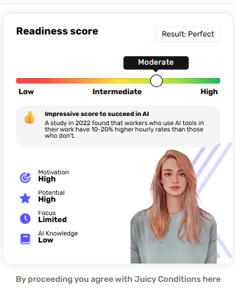
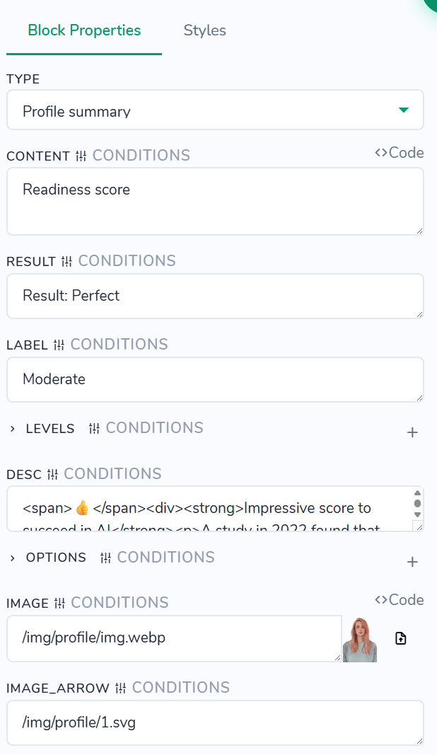
Styles tab - Colors, Typography and Container are adjustable.
Structures > Redirect to URL
"type": "redirect-url"
The Redirect to URL block accepts any URL value you provide, stays invisible for the user on the page, and automatically redirects them to that URL after the specified Delay in Milliseconds (for example, 8000 value is equal to 8 seconds), or immediately when the screen is opened and if the Delay in Milliseconds is left empty.

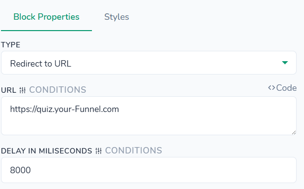
Styles tab - no styles defined for this block type.
Structures > Review: Card with stars
"type": "review"
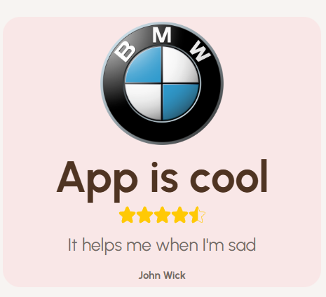
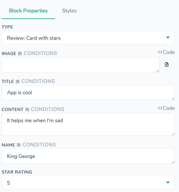
Styles tab - control the appearance of the review/testimonial card: image, title, star rating, main text, customer name, and container. All settings here affect only this review block instance and are applied on top of your global theme styles. You can customize background and text colors for the card, stars icon color, and separate colors for title, content, and name, including optional span colors for highlighted words; adjust font weights, sizes, and line heights for title, content, and name; set star icon dimensions, card padding, various bottom margins (image, title, stars, content), and the gap between items; configure border and border radius for the image and container; control alignment for the whole block and individually for image, title, stars, content, and name; switch layout display and flex direction; and optionally define container background, padding, margin, border, and border radius around the entire review section.
Structures > Review: Expert card
"type": "review-card"
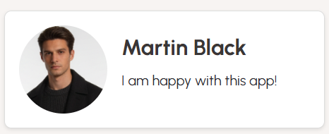
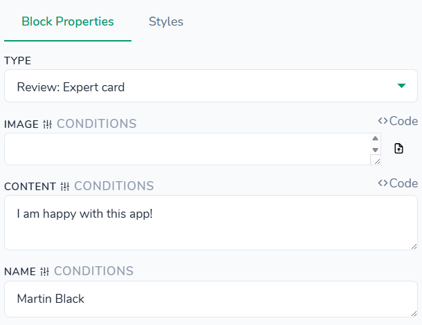
Styles tab - control the appearance of the review card with avatar, title, body text, and description spans. All settings here affect only this review block instance and are applied on top of your global theme styles. You can customize background, title, description, and title/description span colors; adjust font sizes, weights, and line heights for the title and description; set avatar image width/height, card padding, global gap between sections, and negative/positive body gap; configure border and border radius for the card; and define separate font settings for description spans. Layout options let you control text alignment for avatar, body, title, and description, as well as flex display, align/justify content, and flex direction for the overall block and inner body section. Additionally, you can style the container around the review with background, padding, margin, border, and border radius.
Structures > Review: Facebook
"type": "review-fb"
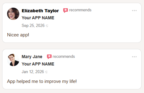
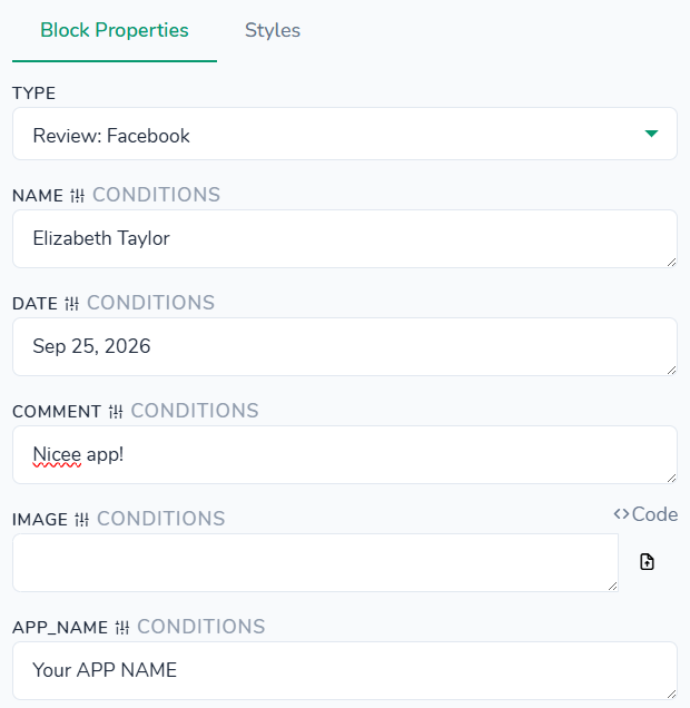
Styles tab - control the appearance and layout of the multi‑row reviews table: avatar, name, role, data row, and body text. All settings here affect only this reviews block instance and are applied on top of your global theme styles. You can customize colors for the background, name, recommendation label, dots/ellipsis icon, role, data, and body text, plus span colors for name, recommendation, role, and data. Typography options let you configure font family, weight, size, and line height separately for name, role, data, and body, including span font settings. Spacing settings cover outer margin and padding, inner padding, right margin for the name, vertical gaps between head/data/body sections, column gaps, and individual bottom gaps for top, recommendation, role, data, and body rows; you can also set avatar image size. Layout controls let you define display type, flex direction, and align/justify content for the whole block as well as for head, inner, top, bottom, and data sections. Border & radius settings apply a shared border and corner rounding to the review table, and the container panel lets you add a background, padding, margin, border, and border radius around the entire reviews section.
Structures > Review: Twitter
"type": "twitter-review"
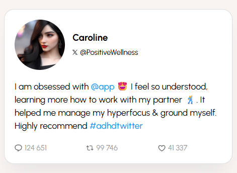
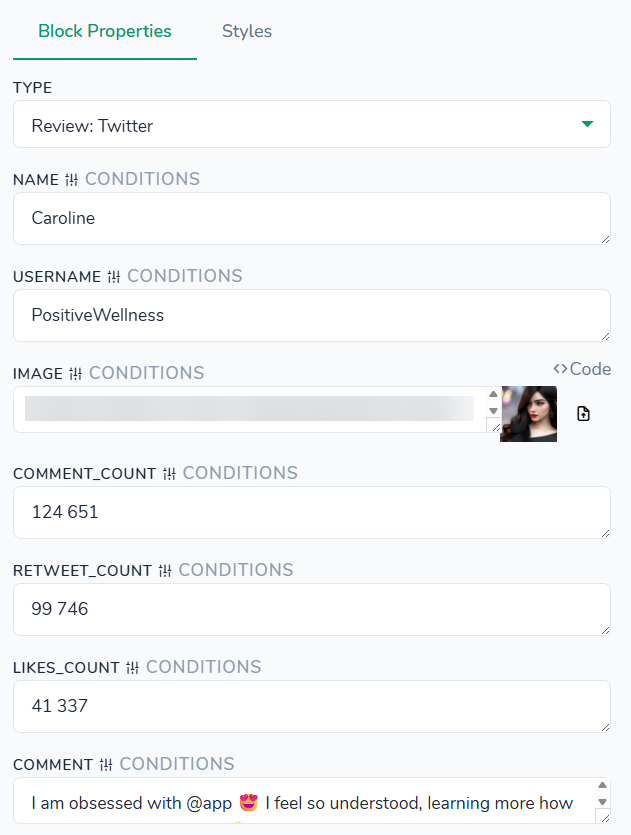
Styles tab - control the appearance of the Twitter‑style review card with avatar, username, handle, tweet text, and counters. All settings here affect only this review block instance and are applied on top of your global theme styles. You can customize background color, main text color, span color inside the tweet, and a separate muted color for the bottom counters; configure line height, font sizes, and weights for the user name and tweet content; set avatar size, SVG icon sizes, and minimum width for the counters row; adjust gaps between user/avatar, username and handle, counters, and the overall bottom margin, plus inner card padding; and define border, border radius, and box shadow for the card. Additionally, you can style the surrounding container with background, padding, margin, border, and border radius.
Structures > Slider: Image+Title+Text
"type": "slider-results"
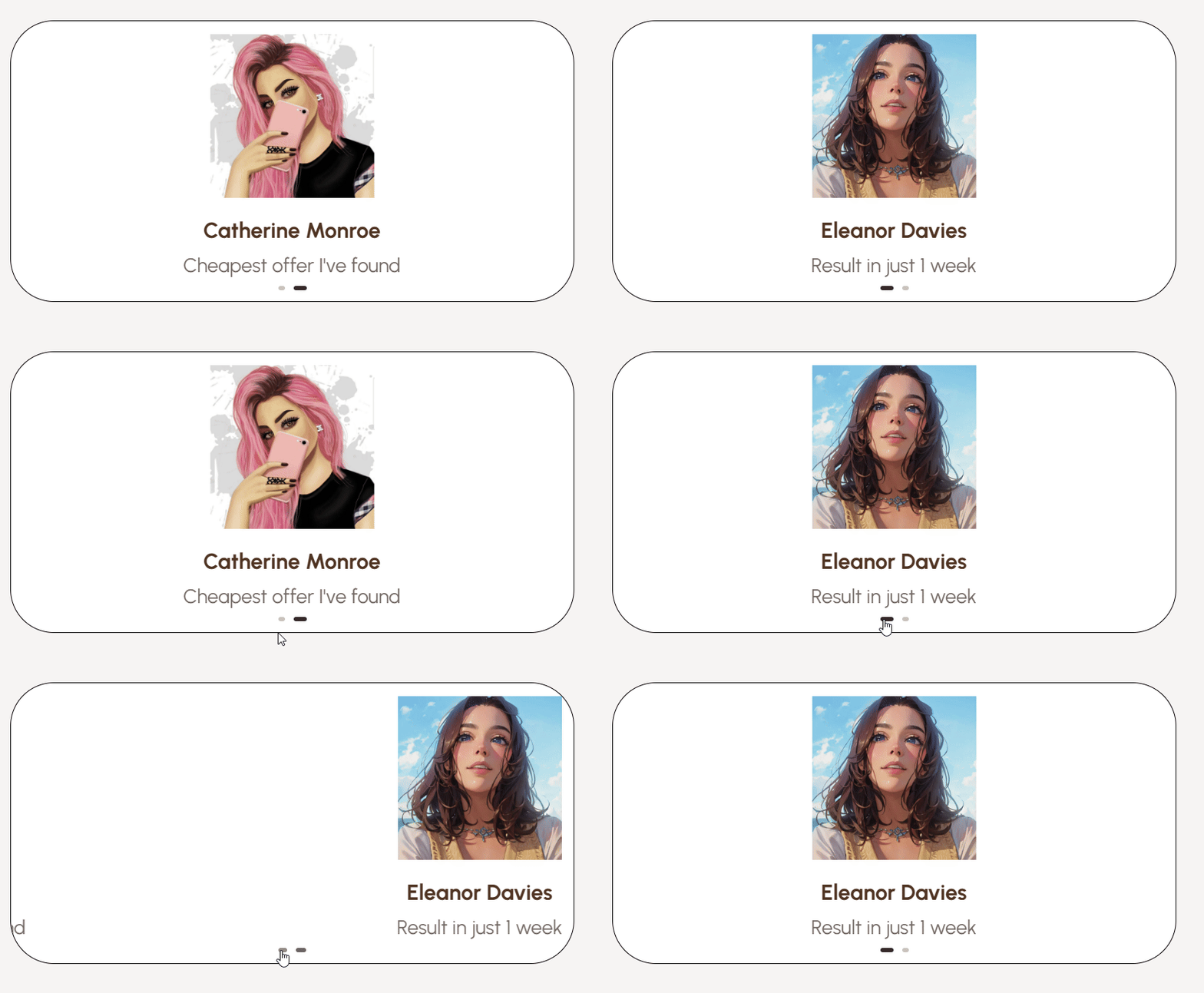
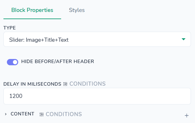
Styles tab - control the appearance of the review card with image, title, and subtitle. All settings here affect only this review block instance and are applied on top of your global theme styles. You can customize background, title, and subtitle text colors; adjust font weights, sizes, and line heights for the title and subtitle; set card image width and height; control inner padding and outer margin (including a separate bottom margin for the subtitle); and configure card border and corner radius for rounded cards. Additionally, you can style the surrounding container with background, padding, margin, border, and border radius around the whole review section.
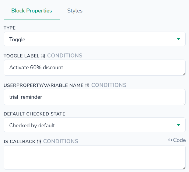
Structures > Toggle
"type": "toggle"
Use case scenario
Let's say you want to change available prices with this toggle. You can check for the price ID in the Plans & Prices section. Then you would need to add the code in JS Callback field:
function(data){if (data.checked) { $('[data-one-click-price-id]').attr('data-one-click-price-id', XXX); } else { $('[data-one-click-price-id]').attr('data-one-click-price-id', YYY);}}
In that code if checked then the price would be XXX, otherwise YYY.

Styles tab - control the appearance of the horizontal toggle slider inside its wrapper card. All settings here affect only this slider instance and are applied on top of your global theme styles. You can customize colors for the wrapper background, hover border, label text, slider track background, slider knob background, and the active (checked) state; set wrapper font family, weight, and size, plus label font family and weight; define wrapper max width, slider width and height, knob width and height, and the knob’s translate‑X value that determines how far it moves when toggled; adjust wrapper padding and the knob’s top/left offsets; configure wrapper border, border radius, and slider/knob border radiuses; add a soft box shadow to the knob; and optionally set container background, padding, margin, border, and border radius around the whole slider block.
Structures > Trial price selector
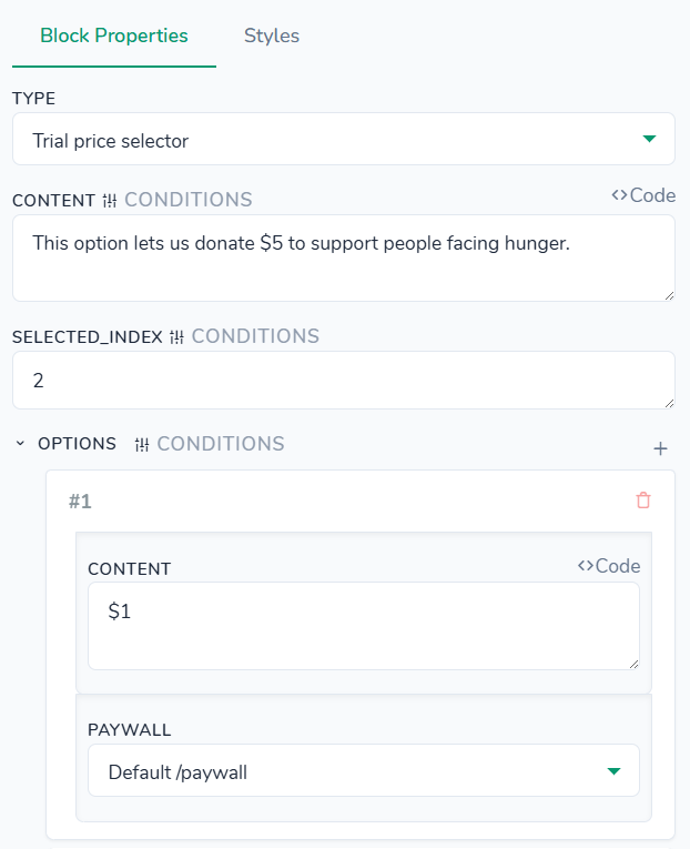
"type": "paywall-selector"
This block lets you redirect the user to any paywall you choose.
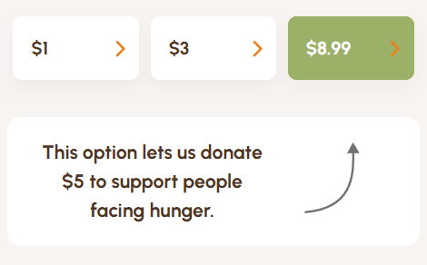
Styles tab - control the appearance of the “trial” hint that shows which option will be applied after the test. All settings here affect only this trial block instance and are applied on top of your global theme styles. You can customize colors for the checked label background, label text and border, hint background and text, and the “selected option after” badge (background and text); adjust hint font weight, size, and line height, plus the font size for the selected option label; set dimensions such as maximum hint text width, hint arrow size, arrow image size, and badge width/height; configure hint gap, padding, and arrow margin, as well as top/right offsets for the selected option badge; style borders and border radius for the hint and option badge, including a hover box shadow; and optionally set container background, padding, margin, border, and border radius around the whole trial section.
Structures > User Subscription Cancel Button
"type": "cancel-subscription-button"
This block can either cancel the user’s subscription immediately or at the end of the current billing period and lets you choose what should happen on successful cancellation.
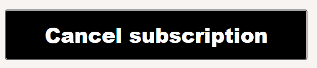
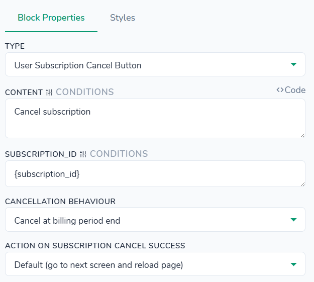
Styles tab - control the appearance of the “Cancel” button that lets the user exit the quiz or close the widget. All settings here affect only this cancel button instance and are applied on top of your global theme styles. You can customize background and text colors, plus separate background, border, and text colors for the disabled state; adjust font size, weight, and line height for the label; optionally set button width and height; configure inner padding, border style, and corner radius; choose button position (fixed vs. default) and text alignment; and style the surrounding container with background, padding, margin, border, and border radius.
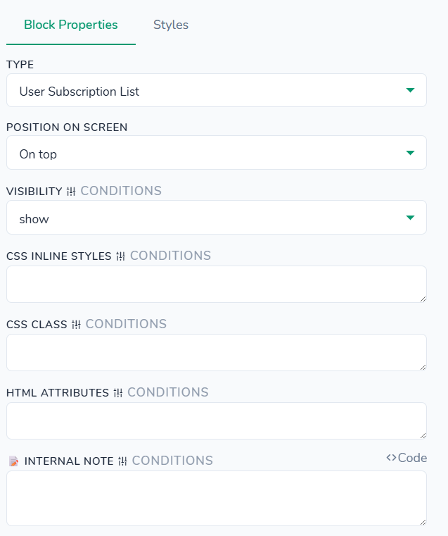
Structures > User Subscription List
"type": "subscriptions-list"
Detailed manual about this block is here.
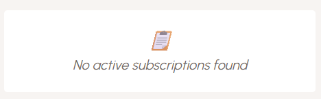
Styles tab - control the appearance of the plan and subscription options shown to the user in this section. All settings here affect only this user block instance and are applied on top of your global theme styles. You can customize colors for the section title, each option background, purchase and canceled options, active/paused/past‑due/canceled statuses, radio accent, labels, plan name, additional info text, price/meta text, payment system label, and the “no subscriptions” state. You can adjust typography for the section title, labels, plan names, info text, prices, meta text, status badges, and payment system labels, including font sizes, weights, line height, and letter spacing. Spacing controls let you set outer margins and container gap, section title margins and padding, option padding and gap, radio and details gaps, name/info/meta/status gaps, meta spacing, and paddings/margins for payment system and “no subscriptions” rows. Border settings include section title bottom border, option and status borders with individual radiuses, payment system border radius, and separate borders for active, purchase, canceled, and “no subscriptions” options. You can also add a box shadow to the selected option card and configure the surrounding container (background, padding, margin, border, border radius).
Loaders >
Loaders > Progress bars
"type": "progress-bars"
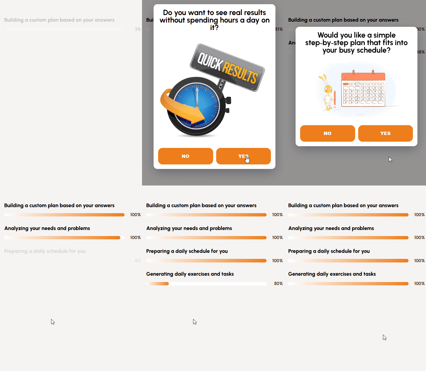
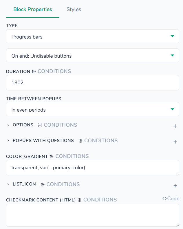
Styles tab - control the appearance of the progress bar and its popup tooltip. All settings here affect only this bar block instance and are applied on top of your global theme styles. You can customize colors for the progress description text, bar line and track, completion percent, popup background, popup buttons (text and background), and the dark overlay behind the popup. Typography options let you set font size and weight for the description and percent text inside the bar, as well as popup title and popup button labels (including line height). Dimensions include bar line height, popup minimum width, and popup image width. Spacing controls let you adjust item margin, description margin, popup padding, popup title bottom margin, gap between popup buttons, and top margin above the buttons. Border settings cover bar line and track corner radius, popup border radius, and individual border radiuses for popup buttons. You can also optionally style the surrounding container with background, padding, margin, border, and border radius.
Loaders > Progress bars cards
"type": "progress-bar-cards"
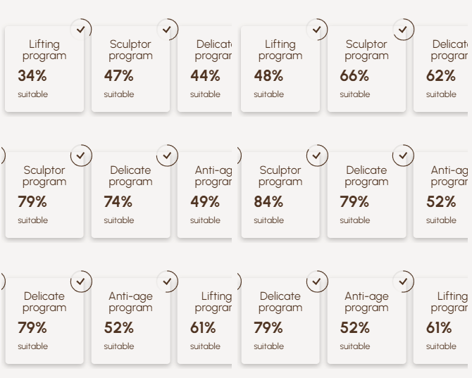
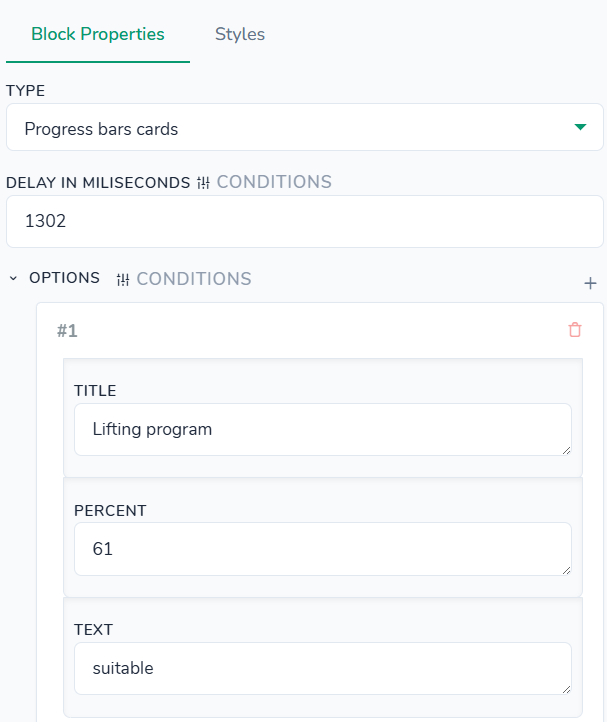
Styles tab - no styles defined for this block type.
Loaders > Progress Circle
"type": "progress-circle"
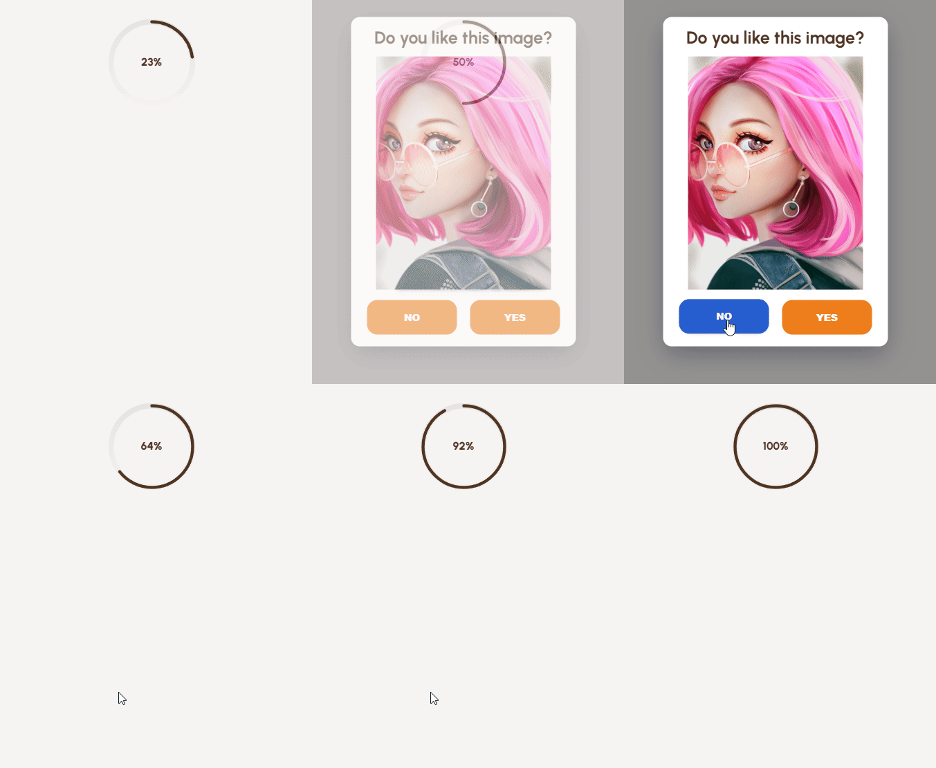
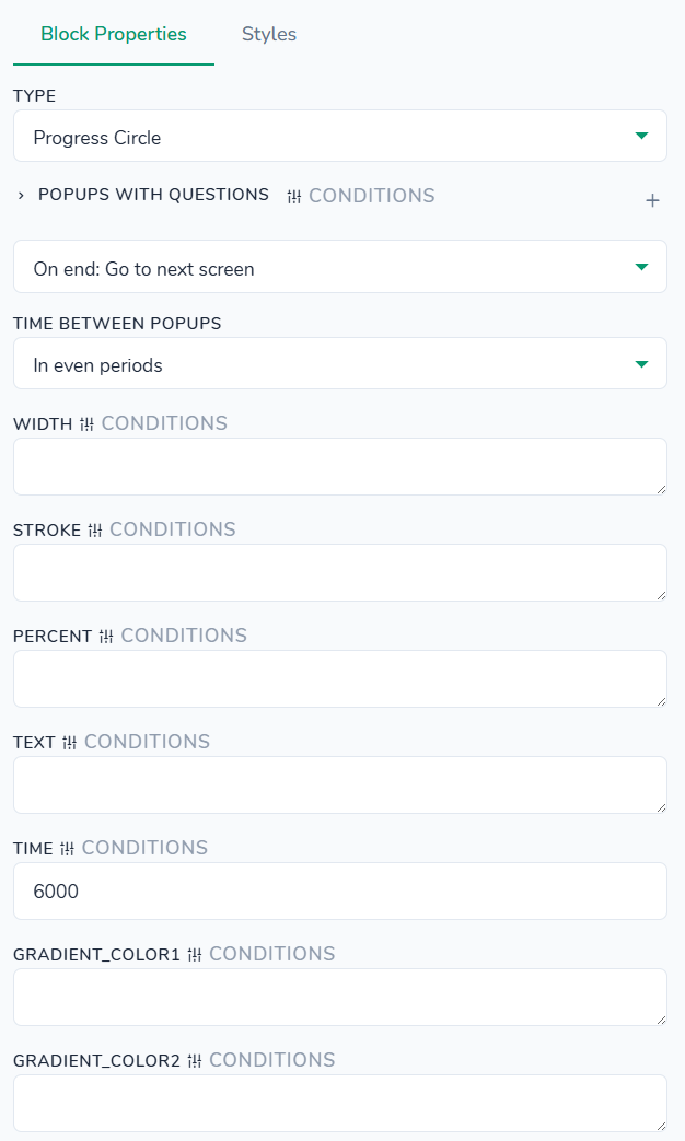
Styles tab - control the appearance of the numeric badge and its popup. All settings here affect only this block instance and are applied on top of your global theme styles. You can customize colors for the number text, popup background and title, popup buttons (text, background, and hover background), and the dark overlay behind the popup. Typography options let you set font size, weight, and family for the number badge, as well as font size and weight for the popup title and popup buttons, including line height and letter spacing. Dimensions include max width/height of the popup, popup minimum width, and popup image width. Spacing controls let you adjust outer margins, popup inner padding, popup title and image bottom margins, and the gap between popup buttons. Border settings cover popup border radius and individual radiuses for popup buttons; you can also configure a box shadow for the popup. Finally, you can style the surrounding container (background, padding, margin, border, and border radius).
Loaders > Slider: Image+Text
"type": "auto-swiper"
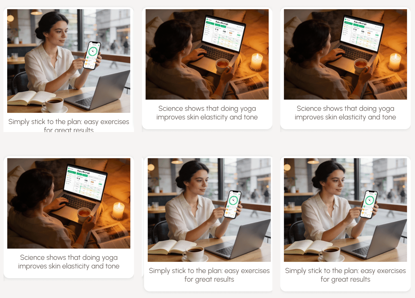
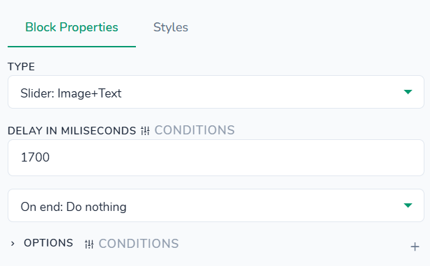
Loaders > Slider: User reviews
"type": "auto-swiper-reviews"
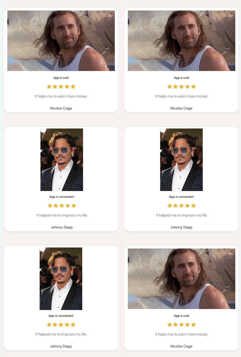
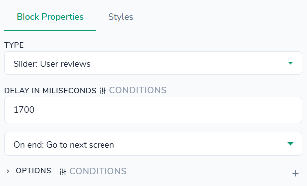
Styles tab - control the appearance and layout of individual user review cards inside the slider. All settings here affect only this slider instance and are applied on top of your global theme styles. You can customize colors for the card background, title, title span, stars, description text (and its span), and reviewer name; adjust typography for title, description, title span, and name, including font sizes, weights, and line height. Dimensions let you set the minimum card width, total card height, and star icon width/height. Spacing controls include inner padding between rows, overall card bottom margin, gap between text lines, and image bottom margin. Border & radius settings define rounded corners for the card and reviewer image, while shadow controls add an outer box shadow. Layout options let you configure display mode, flex direction, align/justify settings for the card content, and separate flex/align/justify settings for the evaluation info row (rating, meta). Container settings (background, padding, margin, border, border radius) let you style the outer wrapper of the whole slider section.
Loaders > Spinner
"type": "spinner"
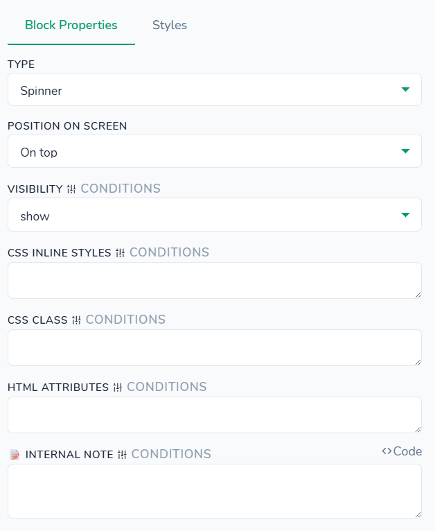
Styles tab - advanced appearance settings for the spinner element and its container. Here you can set the spinner border top color (this controls the visible arc of the circular loader), adjust its width and height to change the spinner size, and choose the border style for the spinner ring. Container options let you enable a colored background behind the spinner, fine‑tune inner padding and outer margins, and optionally add a container border with custom radius so the loading area matches the visual style of other blocks.